Reddit Rebrand
Objective:
Brand identity redesign for a re-introduction of the social platform, Reddit.
Concept:
Reddit is a social media platform and online community where users can post, share, and discuss content across various interest-based forums called subreddits.
My rebrand strategy includes implementing a unique visual design, expanding professional networking subreddits, integrating cross-platform collaborations, and strengthening the community while keeping the freedom of diverse topics.
Highlights:
Designing a customized typeface for a rebrand was a first for me. Through this process, I discovered that a custom-designed typeface can significantly enhance a brand's unique identity, setting Reddit apart from other social media platforms.
My role:
Deliverables:
Concept development, typeface design, rebrand development, animation
Animation, posters,
mock-ups
Tagline:
The taglines revolve around the "from me to you" concept, emphasizing Reddit as a personalized feed that caters to individual user preferences.
Logo Development:
The logo consists of two shapes that come together to create the negative space of the letter "R." The top part of the logo, shaped like a chatbox, represents conversation, while the bottom half symbolizes the feed and responses within a community. This design encapsulates the essence of Reddit, combining discussion and interaction. Additionally, the typeface features a structured grid system that enhances its unique and cohesive visual identity, differentiating Reddit from other social media platforms.
Typography:
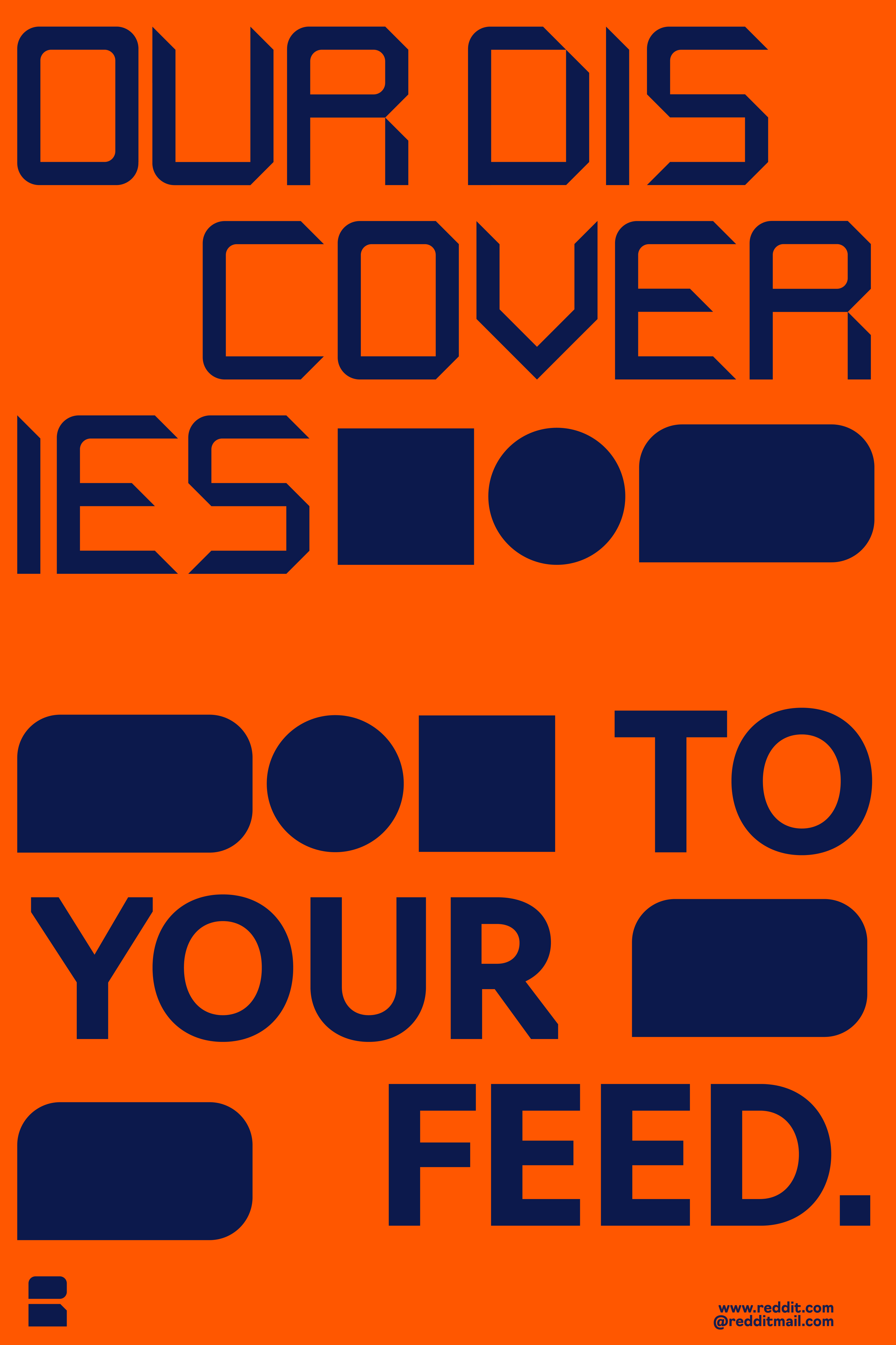
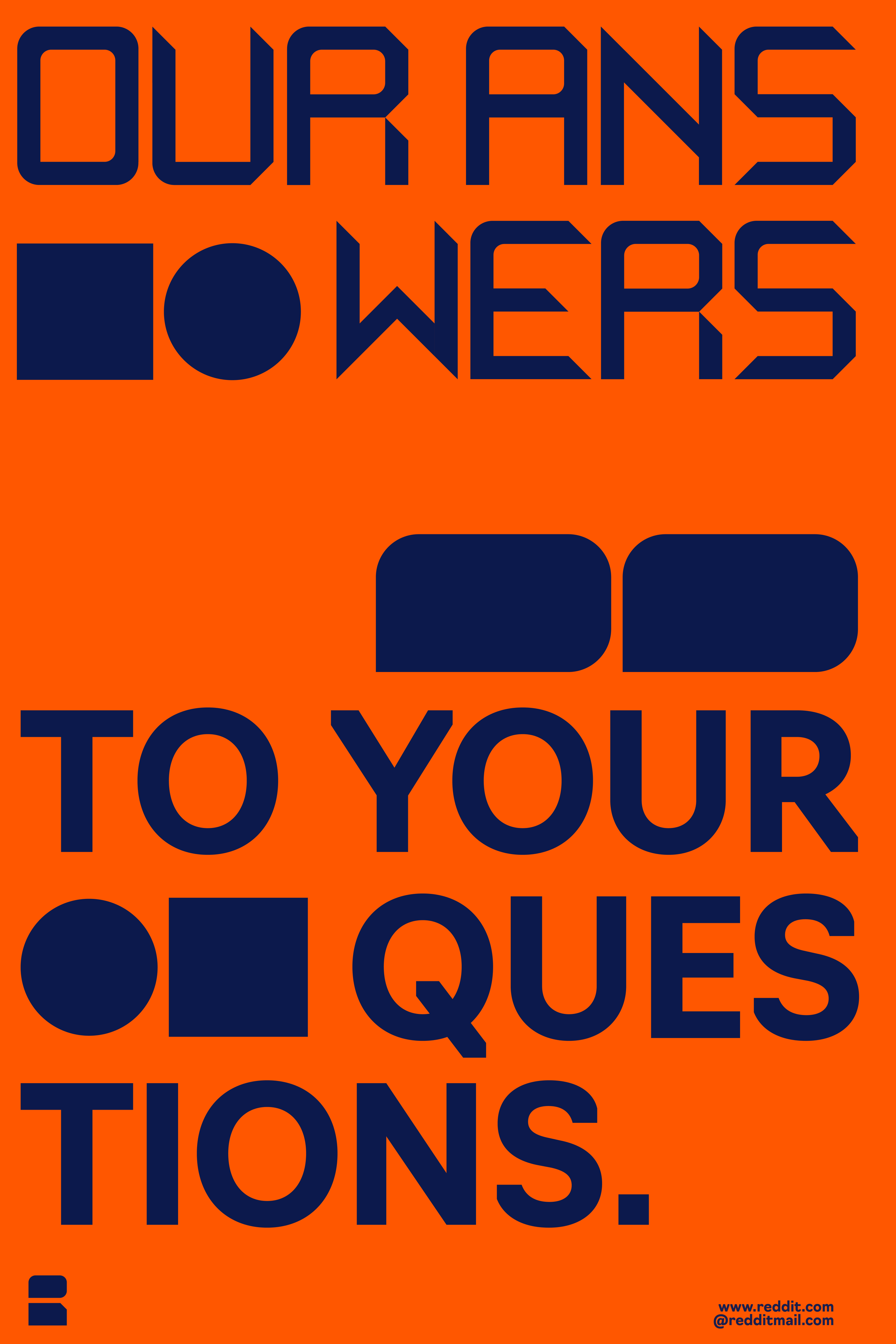
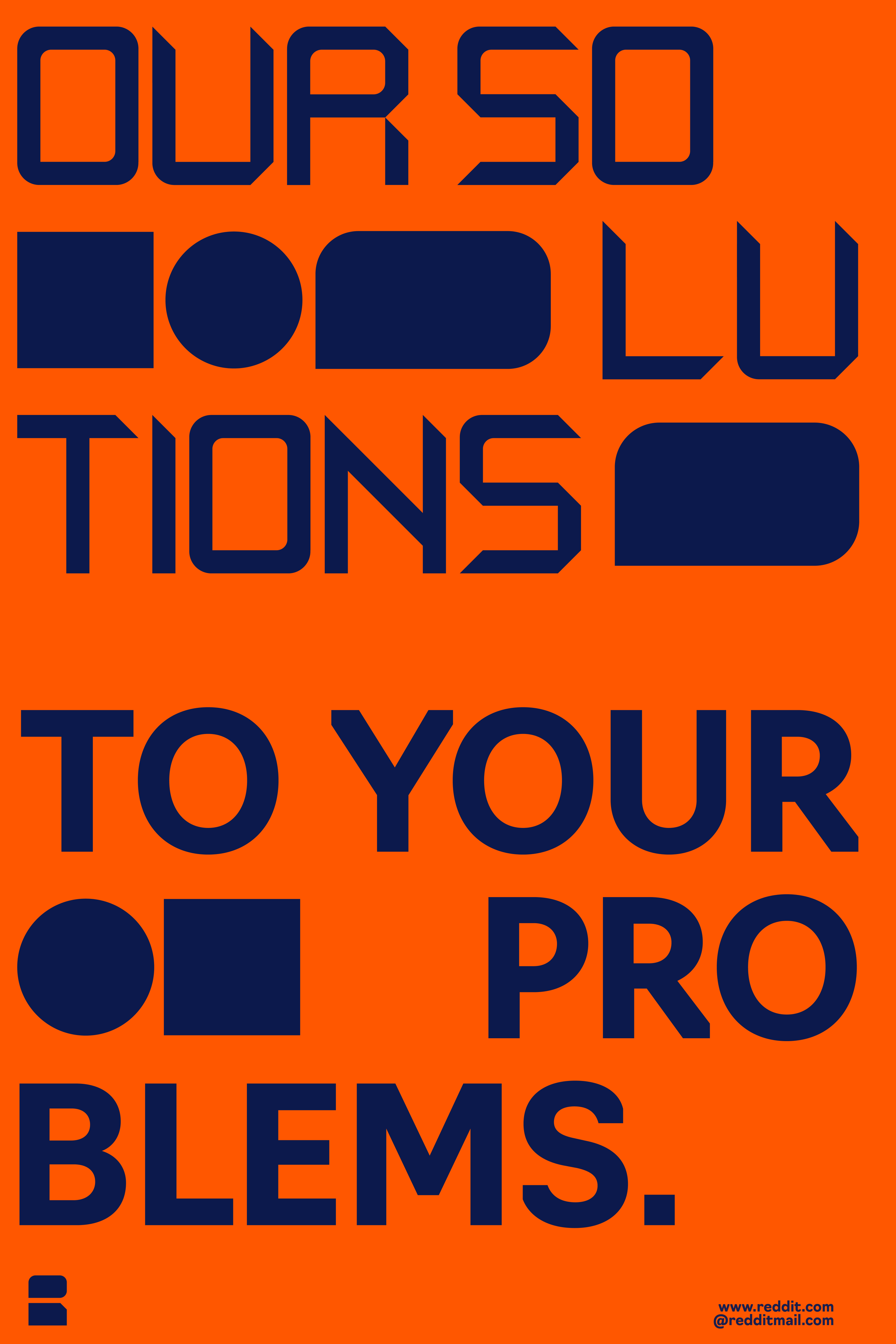
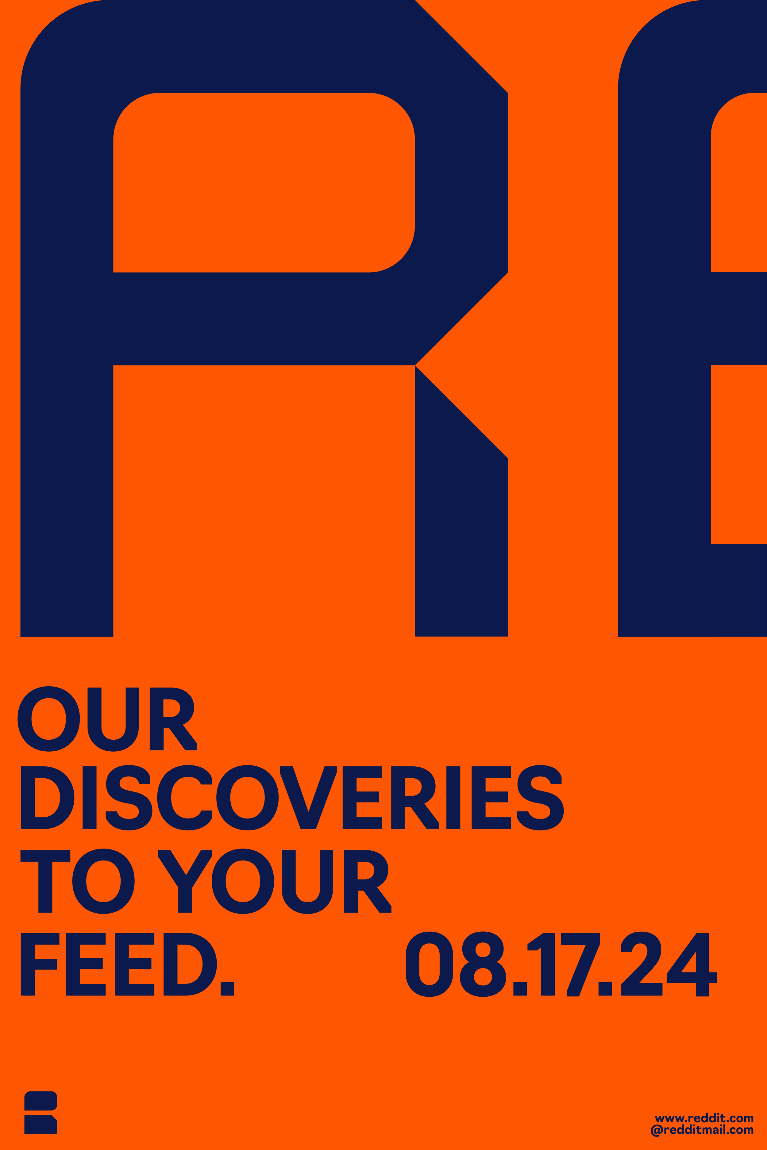
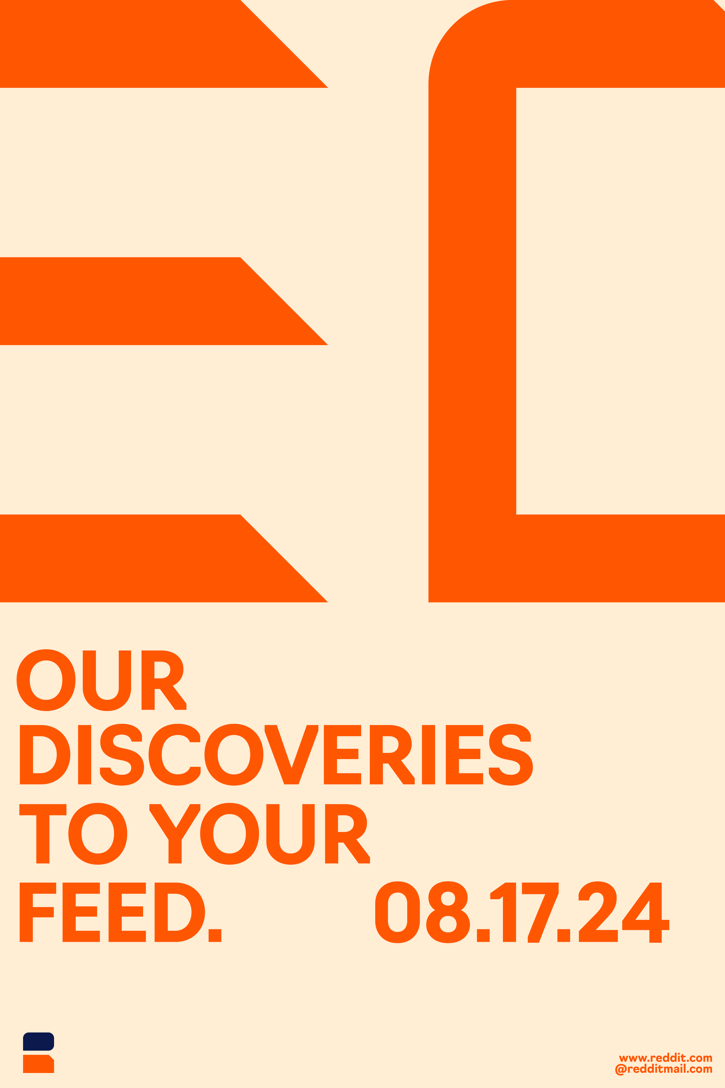
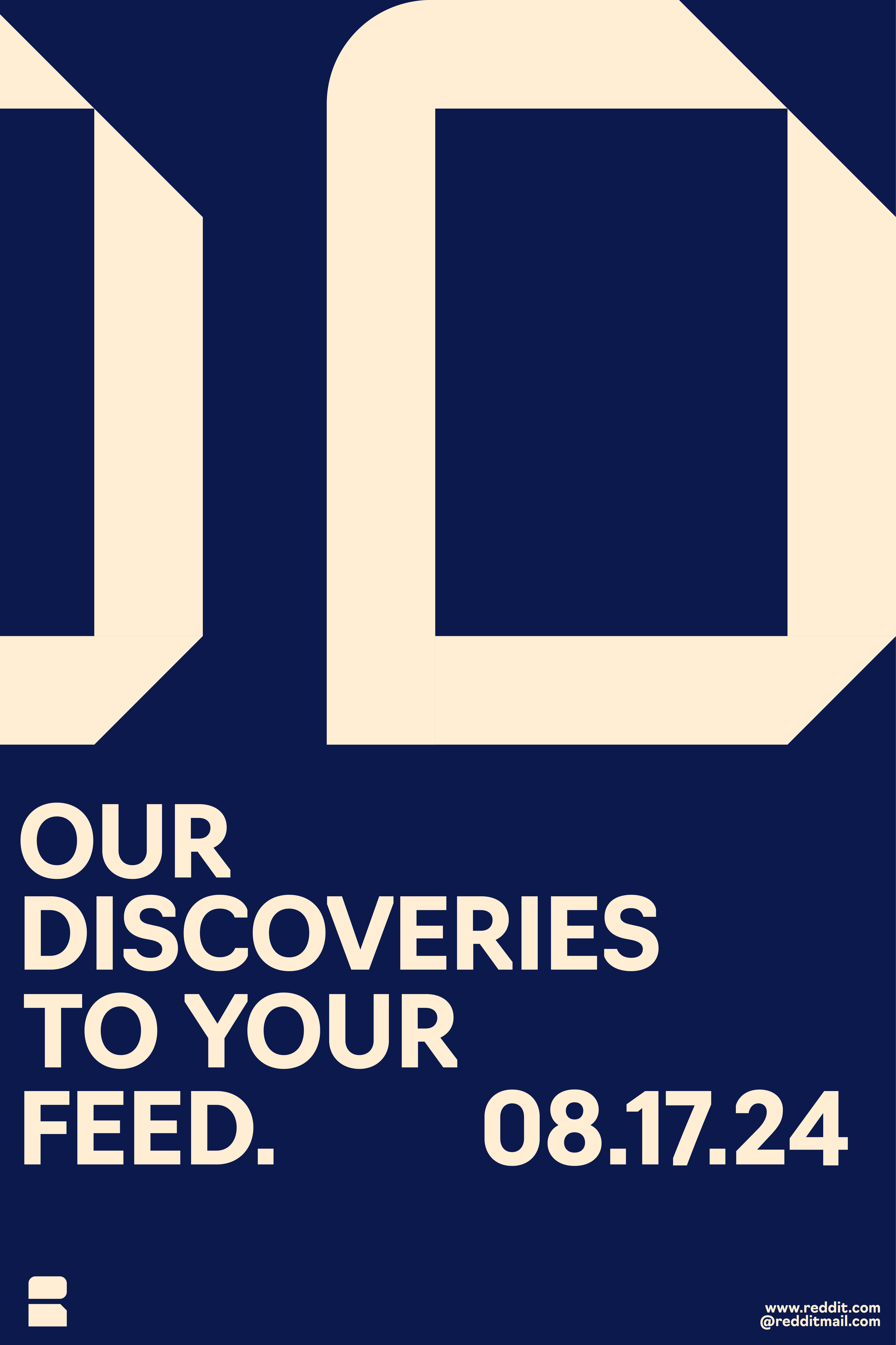
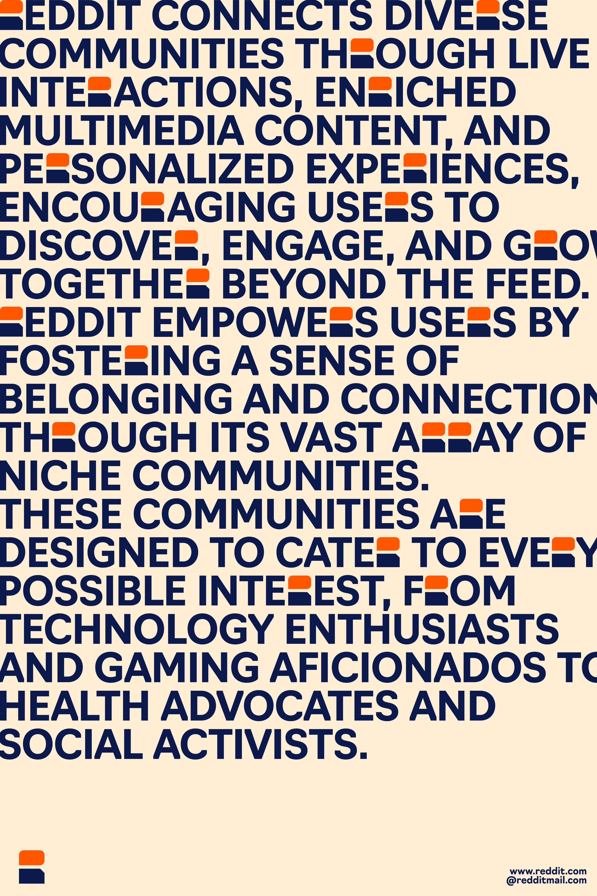
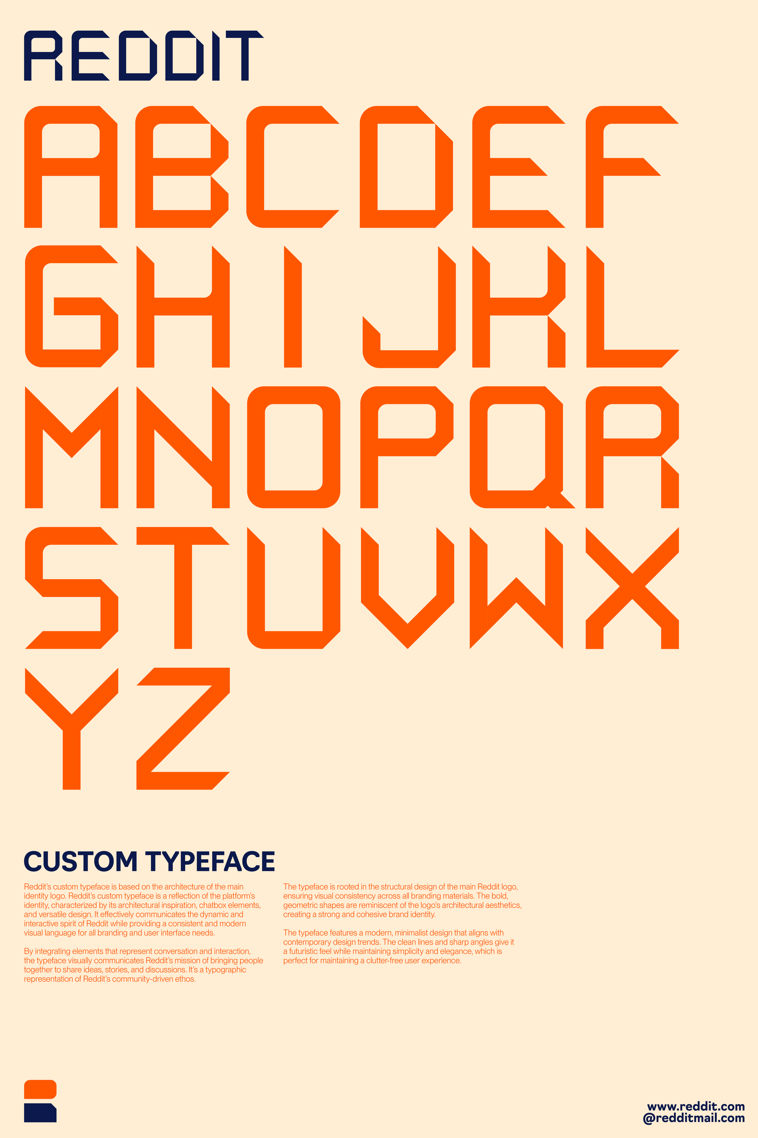
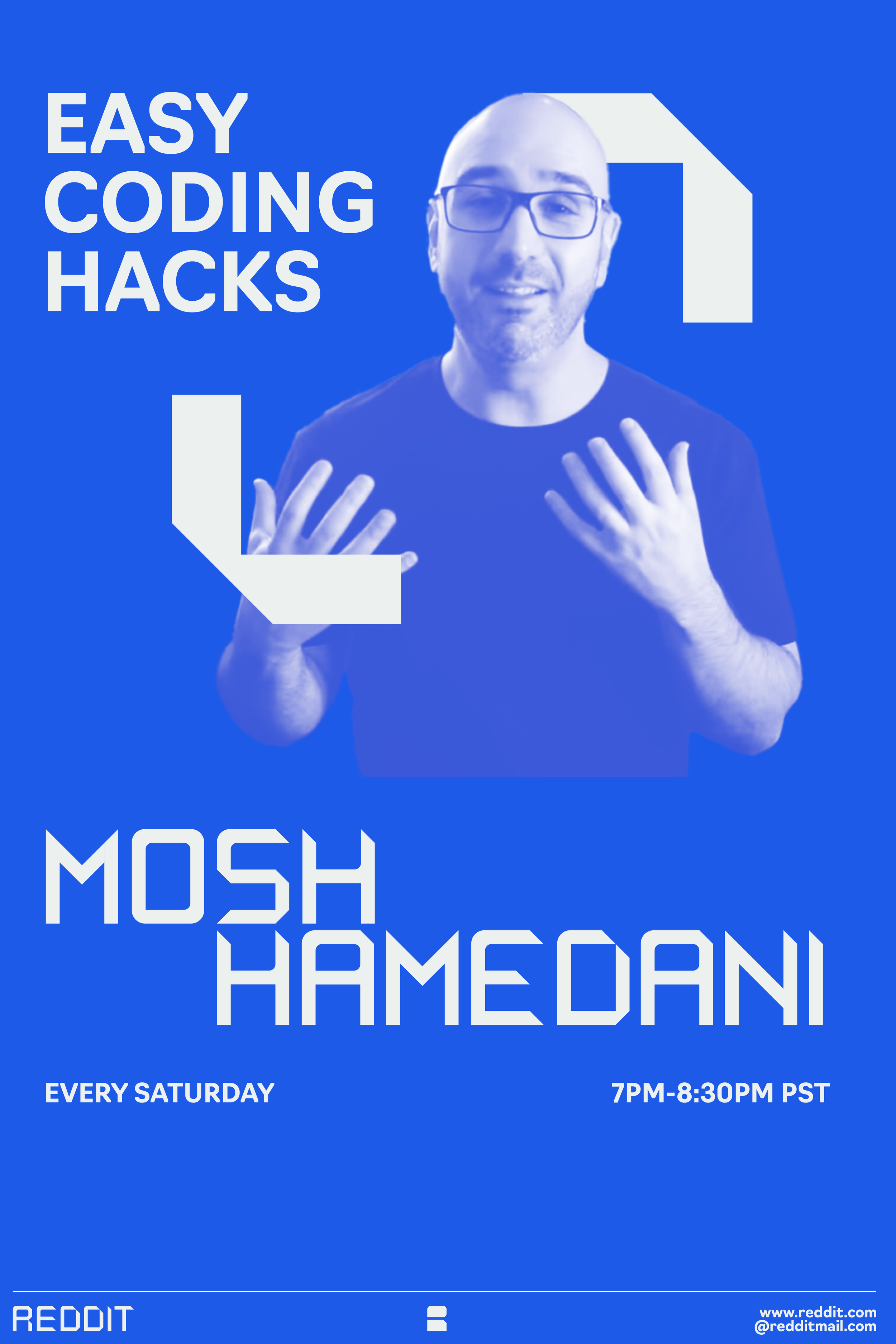
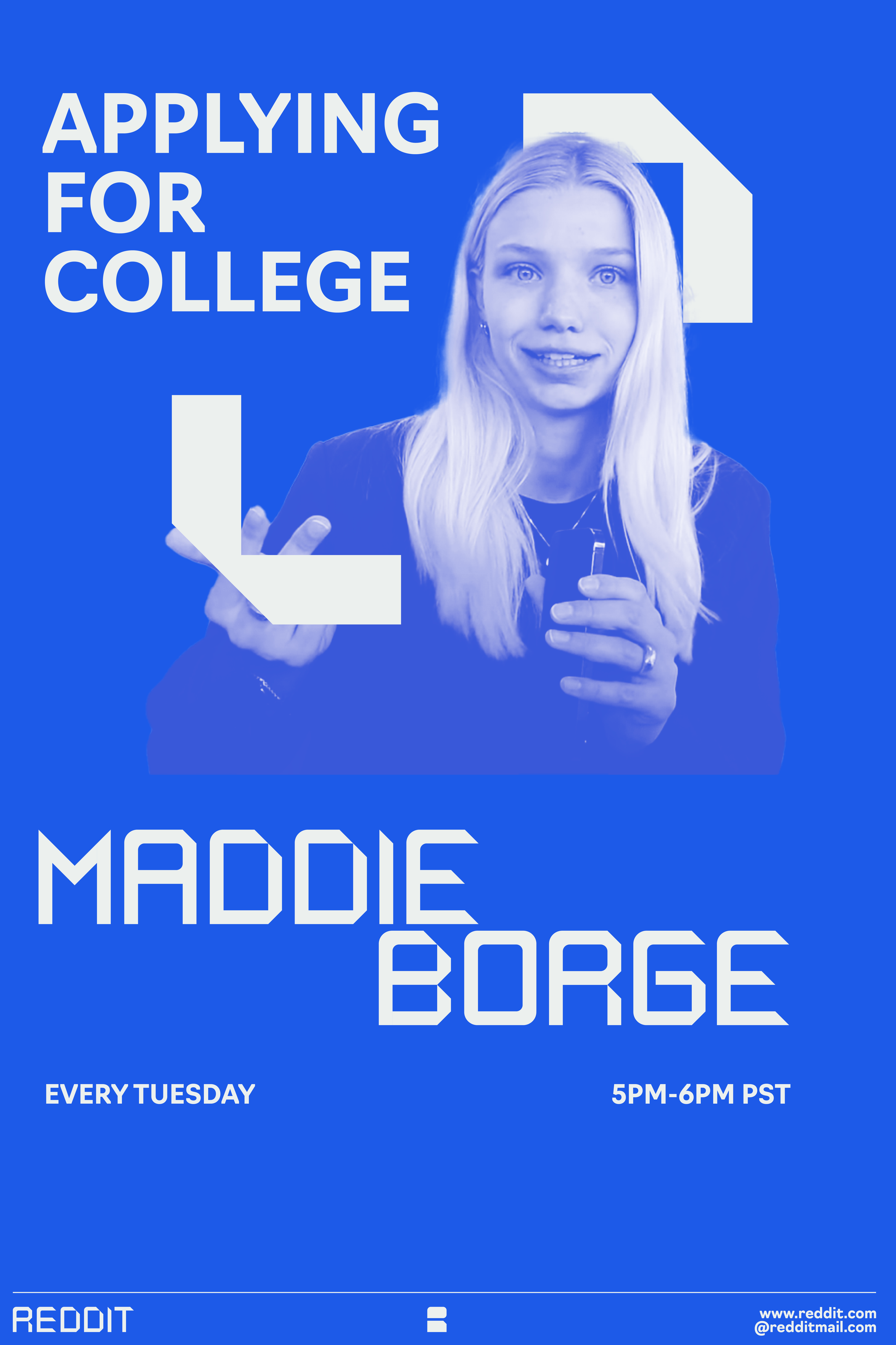
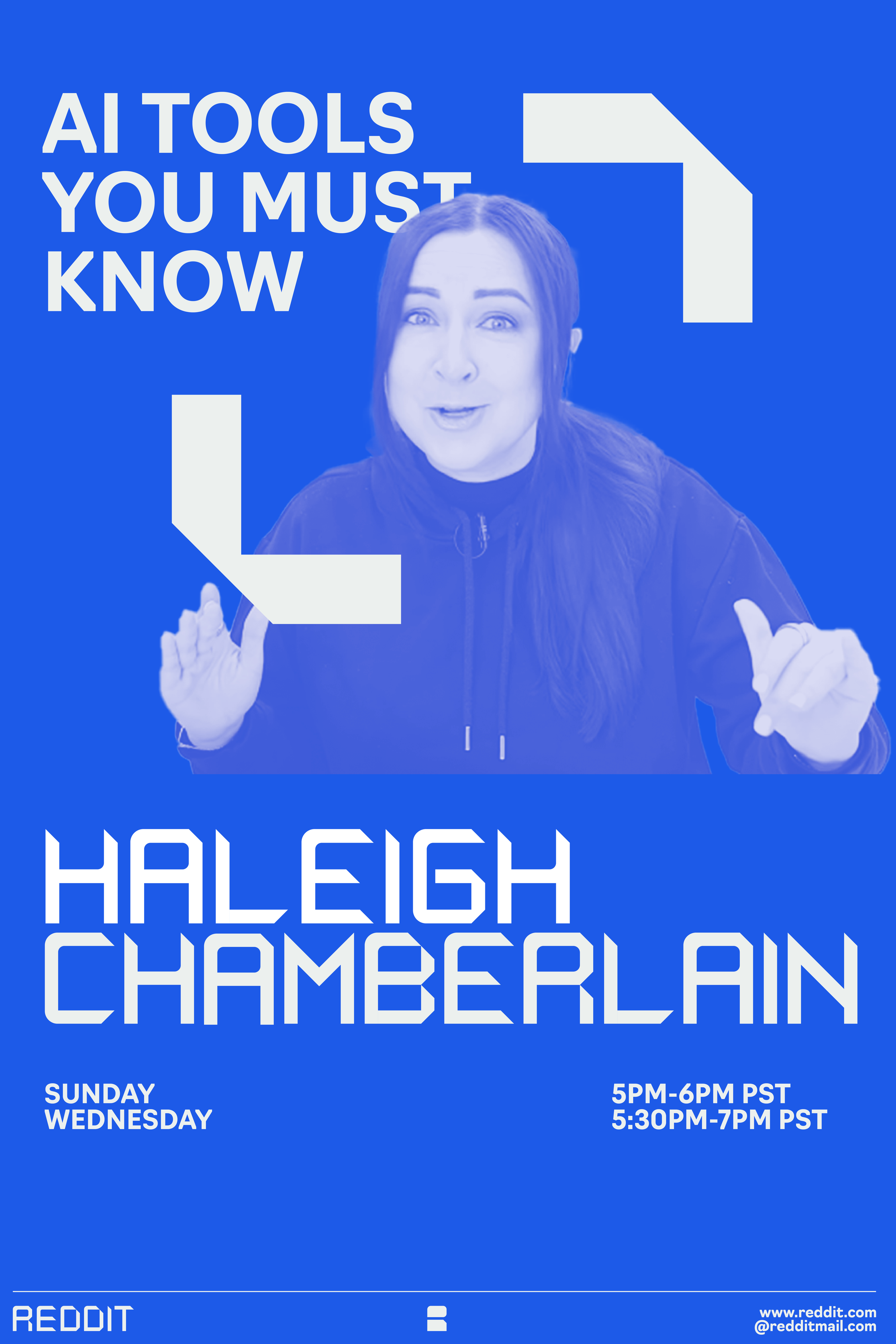
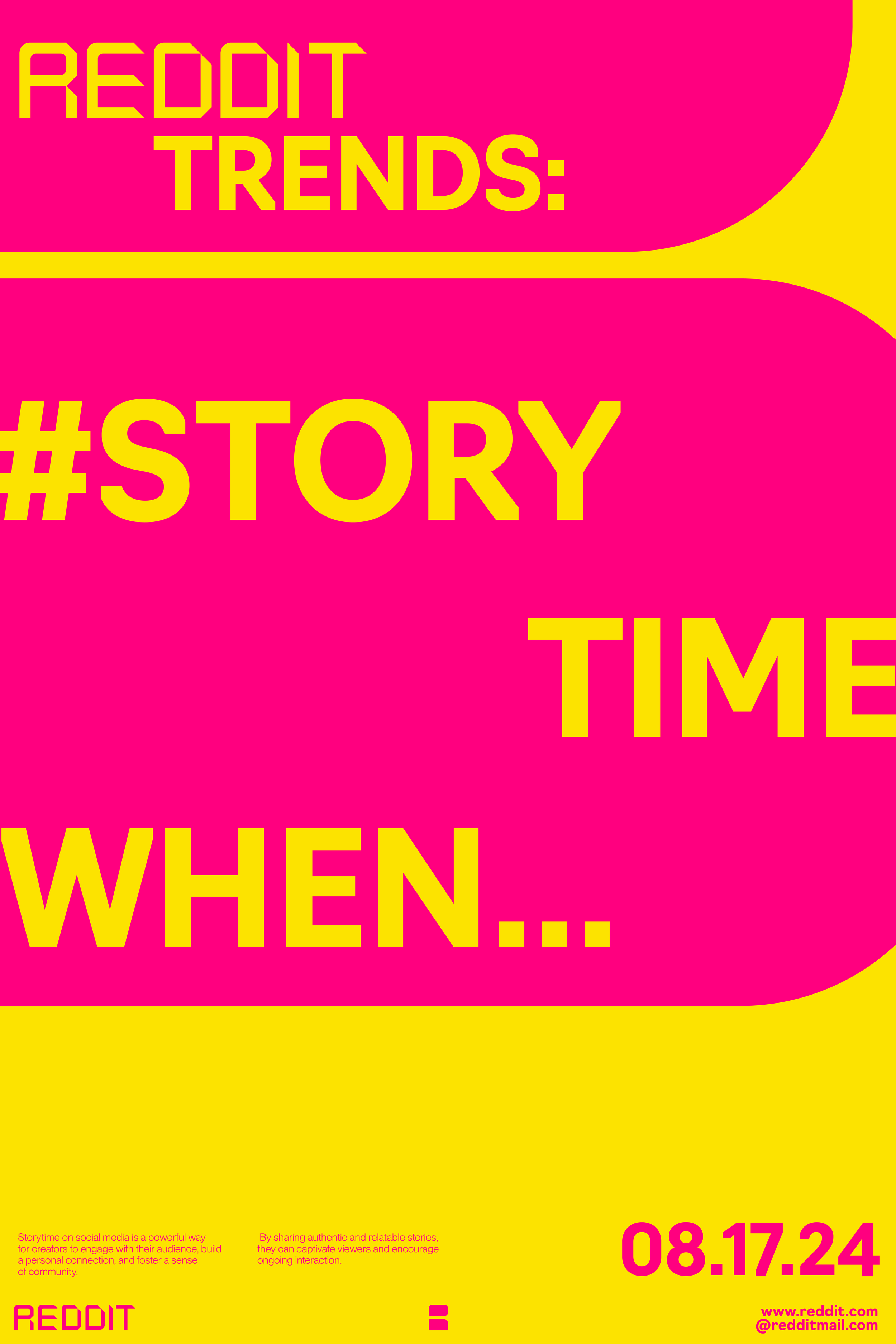
I created a primary custom typeface based on the architecture of the logo. It reflects the platform’s identity, characterized by architectural inspiration, chatbox elements, and versatile design. The typeface is rooted in the structural design of the main Reddit logo, ensuring visual consistency across all branding materials. The bold, geometric shapes are reminiscent of the logo's architectural aesthetics, creating a strong and cohesive brand identity.
Textures:
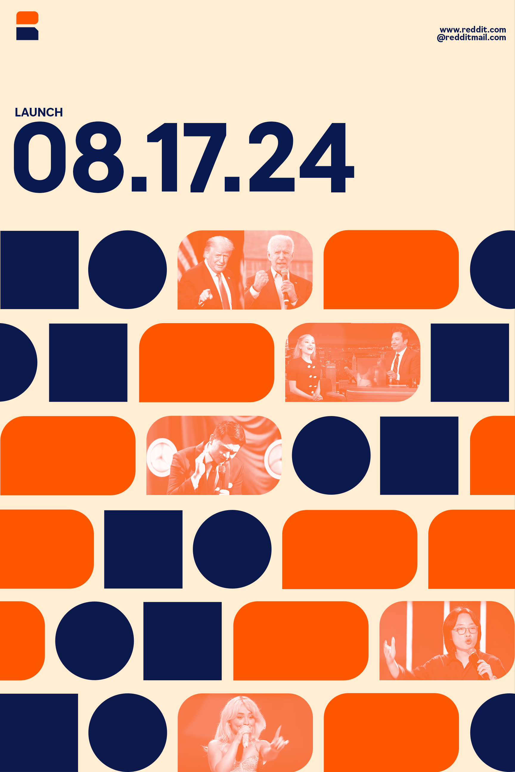
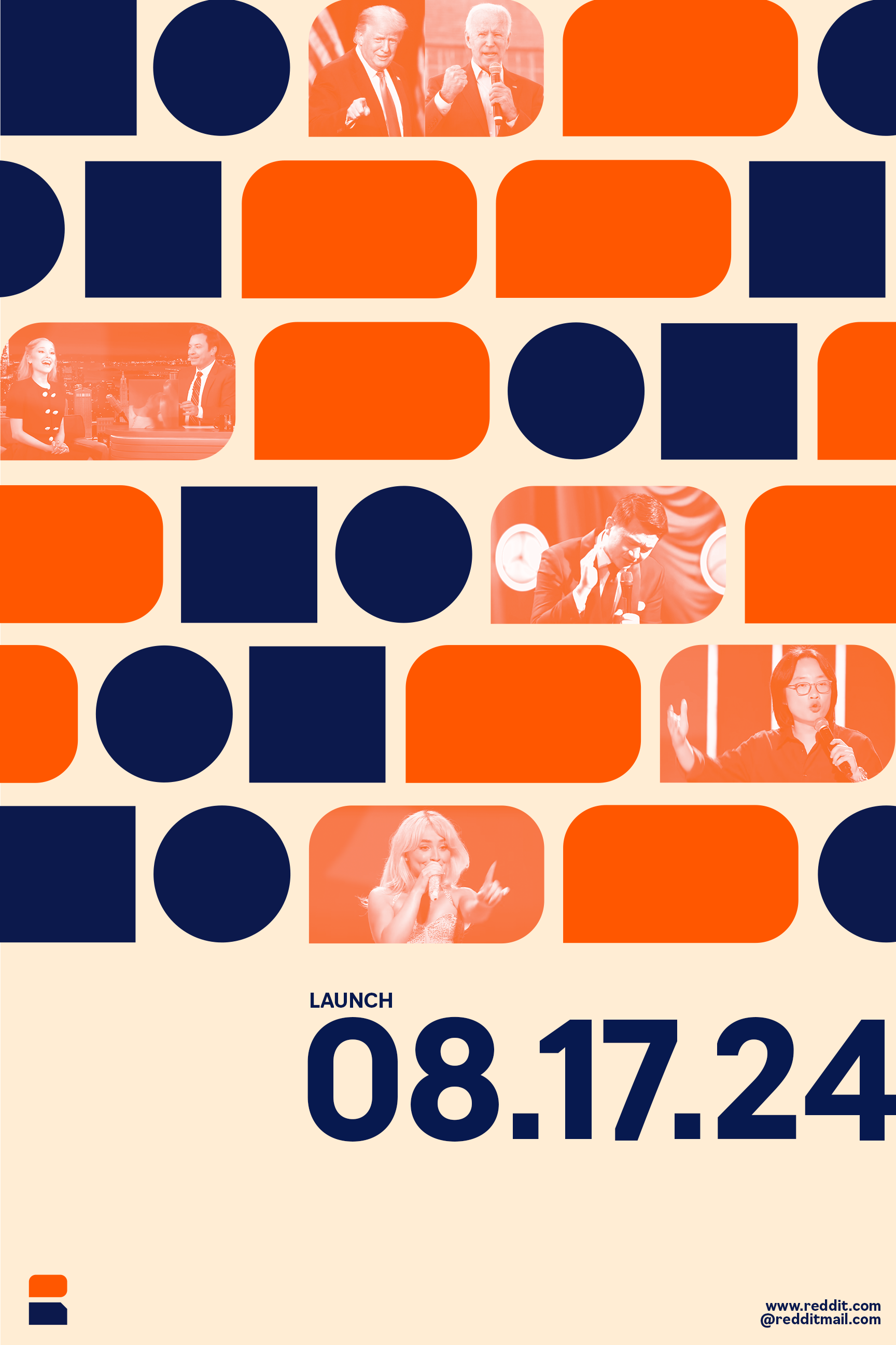
I’ve created primary and secondary textures. The primary textures feature shape patterns that symbolize ongoing conversations and speech patterns. The secondary textures include brackets designed to hold imagery or footage, symbolizing the versatile nature of expansion and contraction while the stacked, structured forms represent replies and formatted forums.
Color Palette:
Each of my brand colors represent different categories of Reddit. While introducing additional colors, I maintained the iconic Reddit orange for immediate brand recognition. The primary palette includes orange for Reddit as a whole, navy blue for the community, and a light cream for insights. The secondary palette features blue for professional content, pink for AskReddit and other communities, yellow for highlights and trends, and a set of teal, gray, and light gray for upvotes, downvotes, and neutral actions, reflecting Reddit's diverse and dynamic environment.
Identity Poster Series:
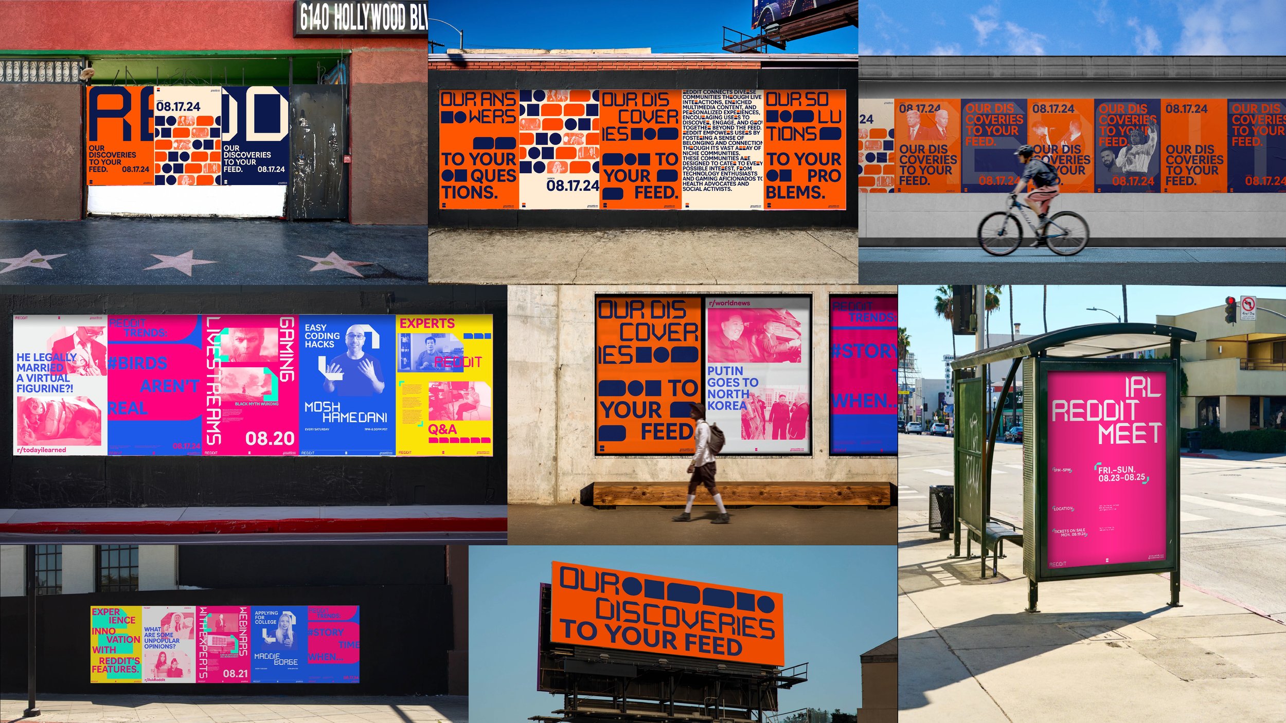
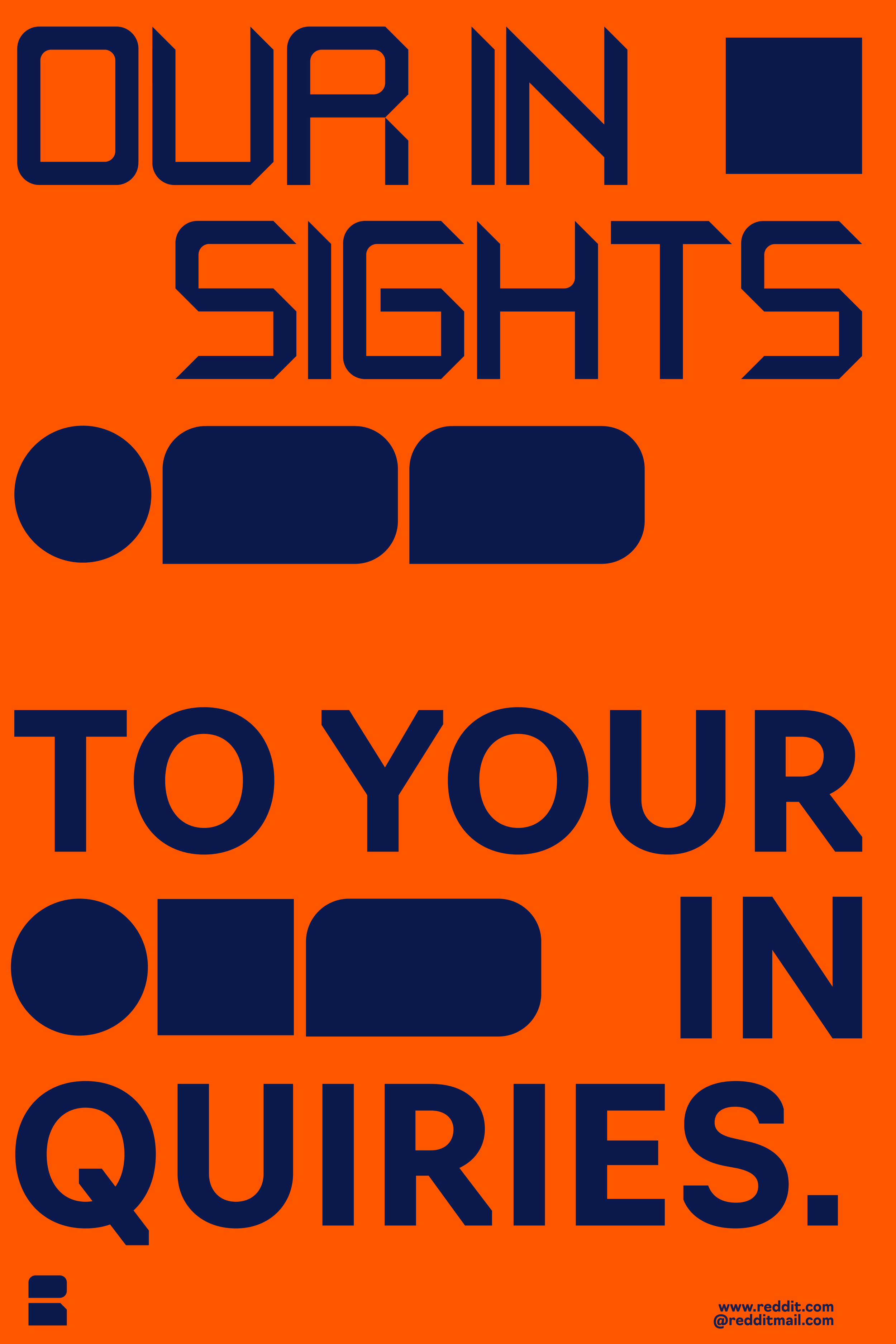
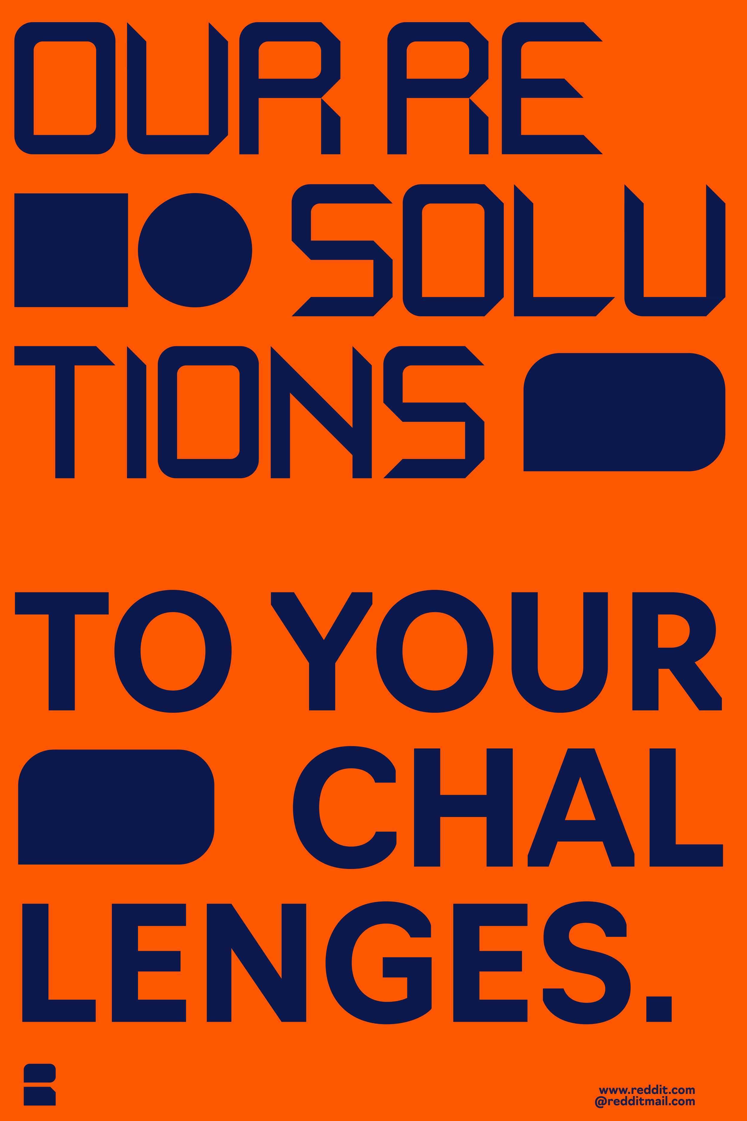
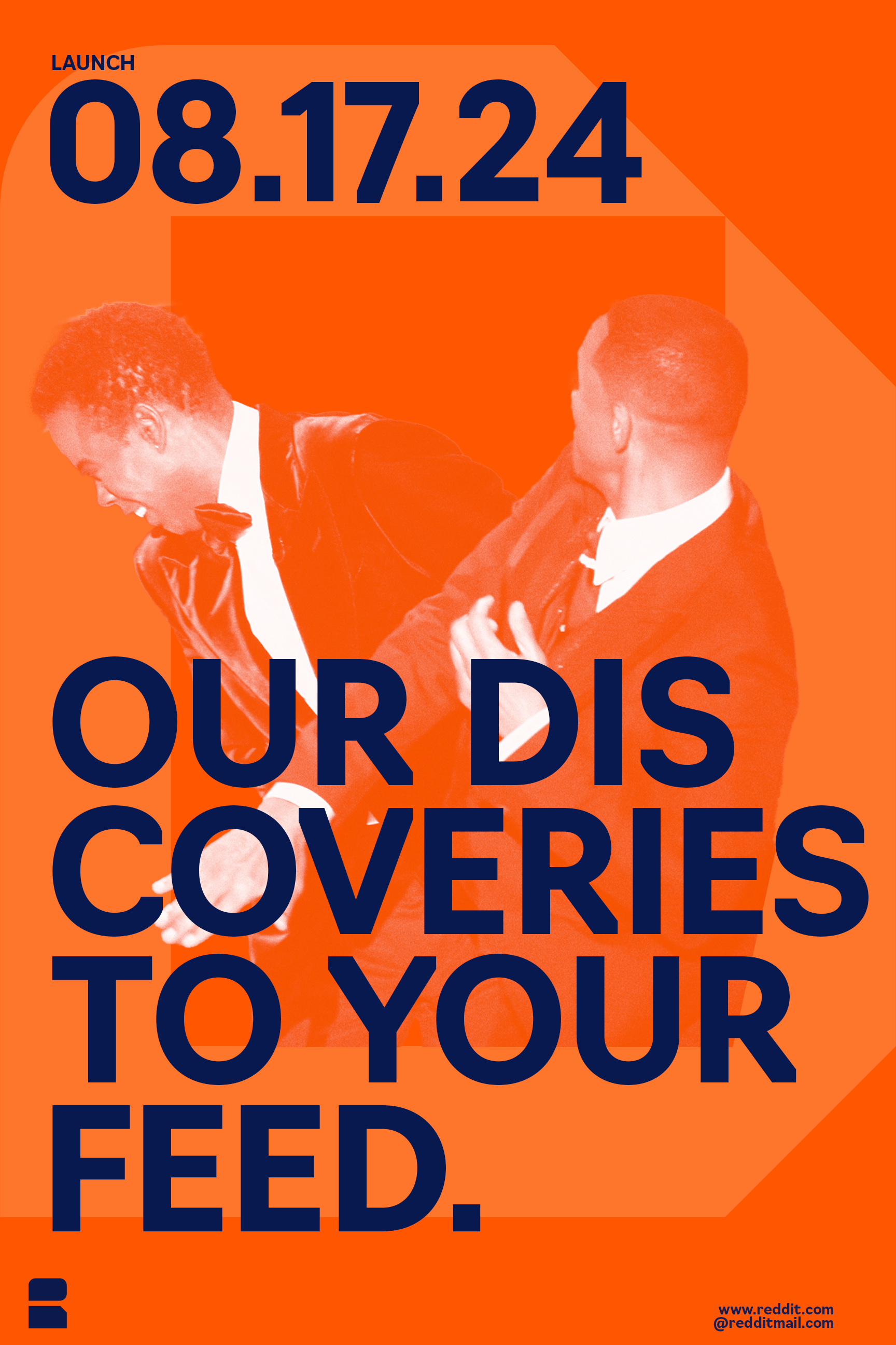
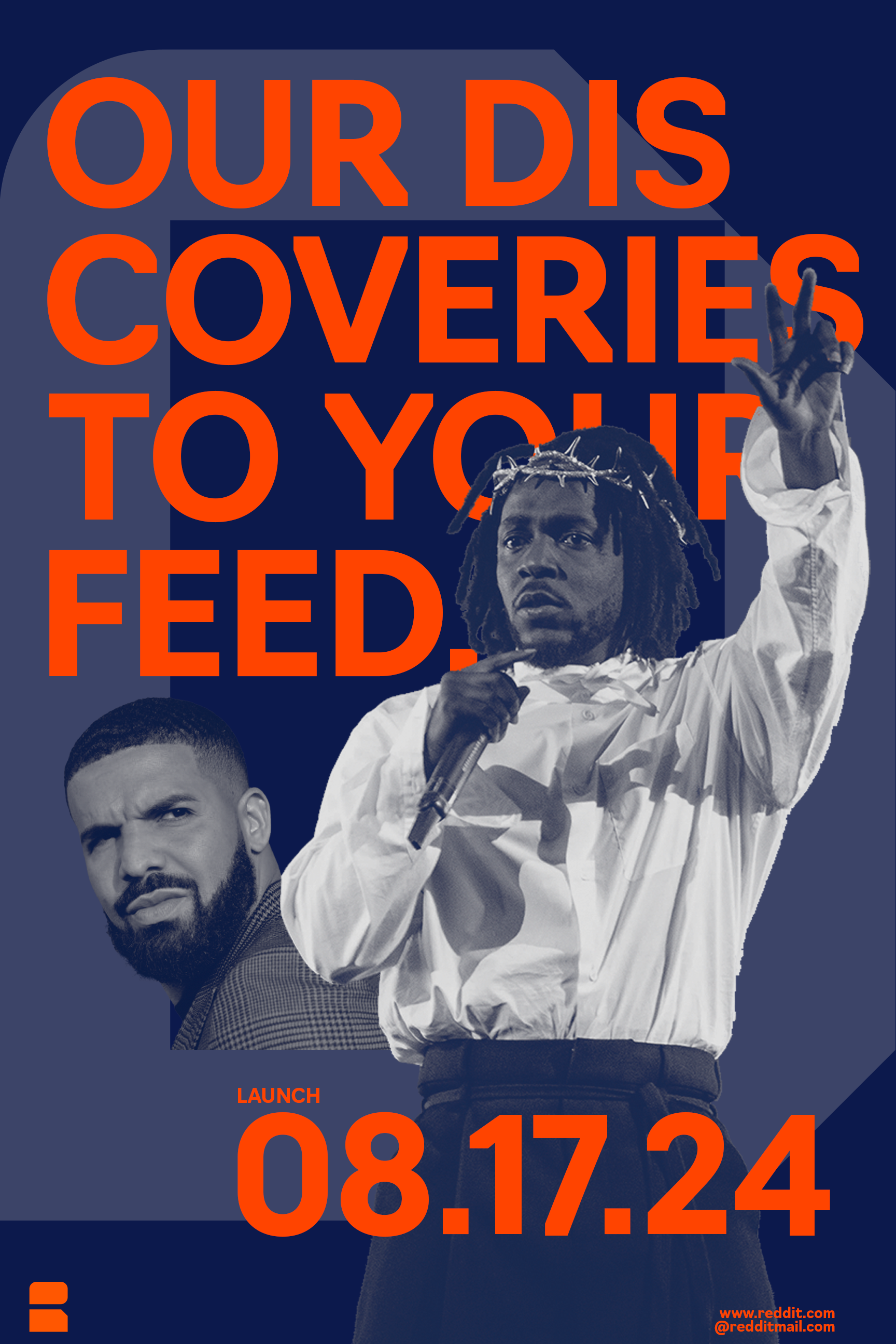
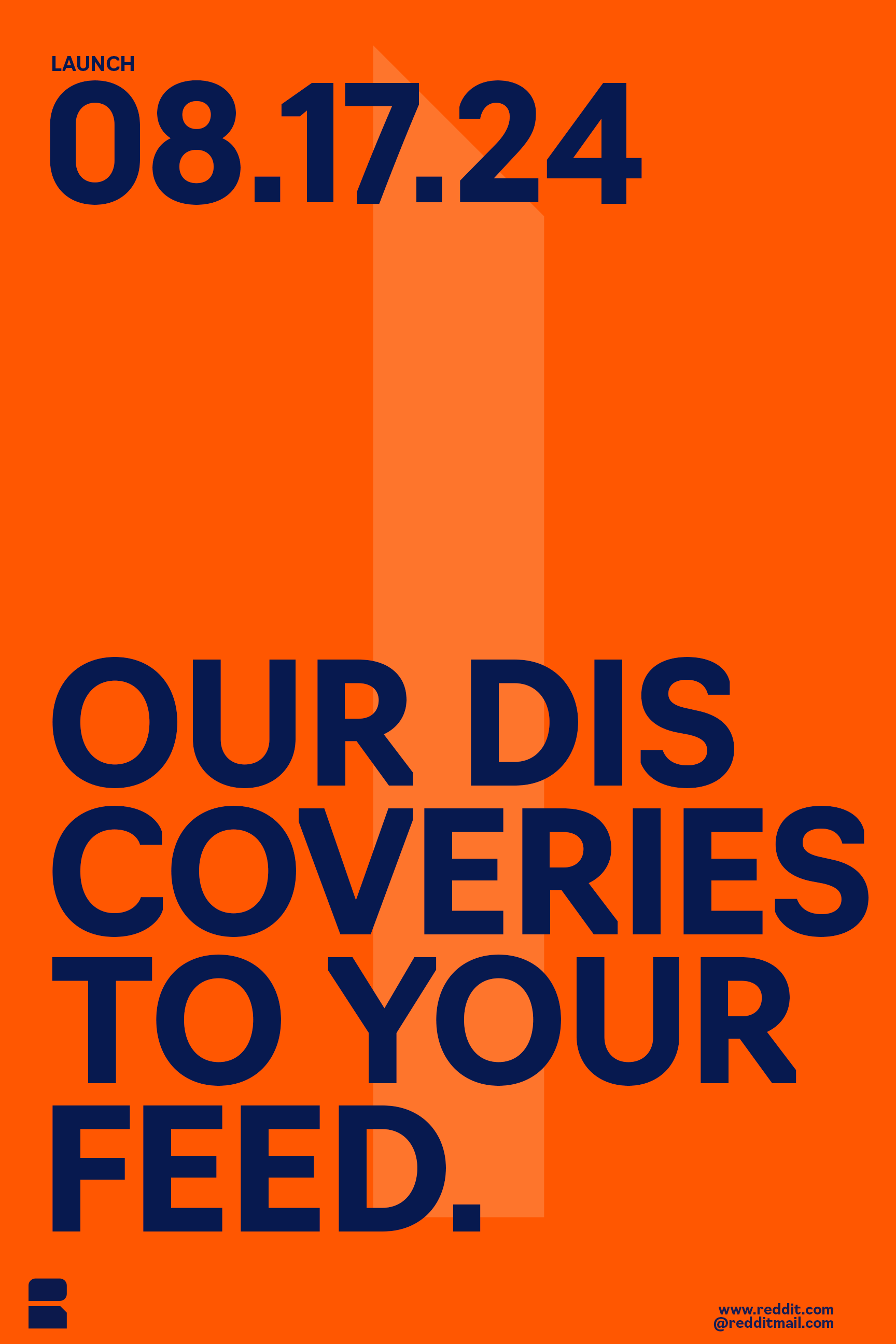
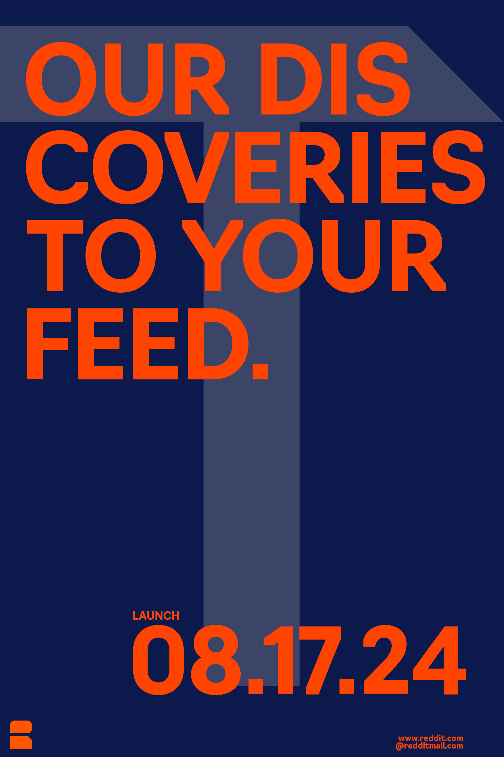
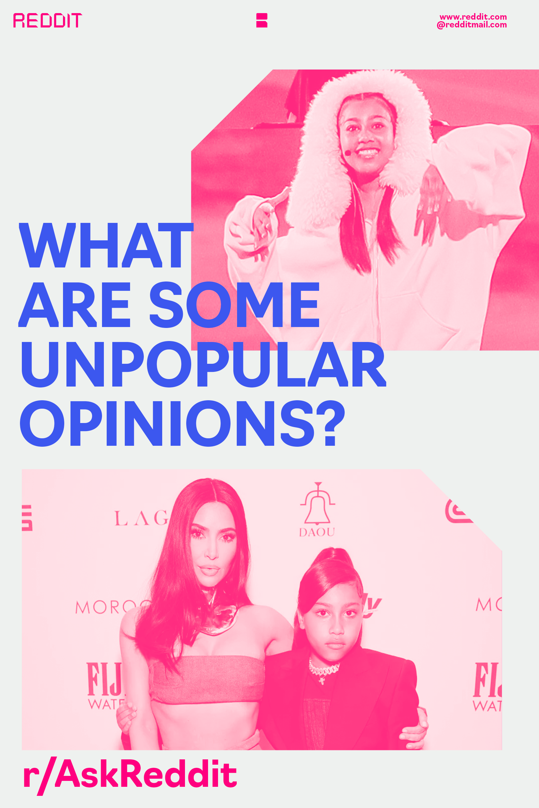
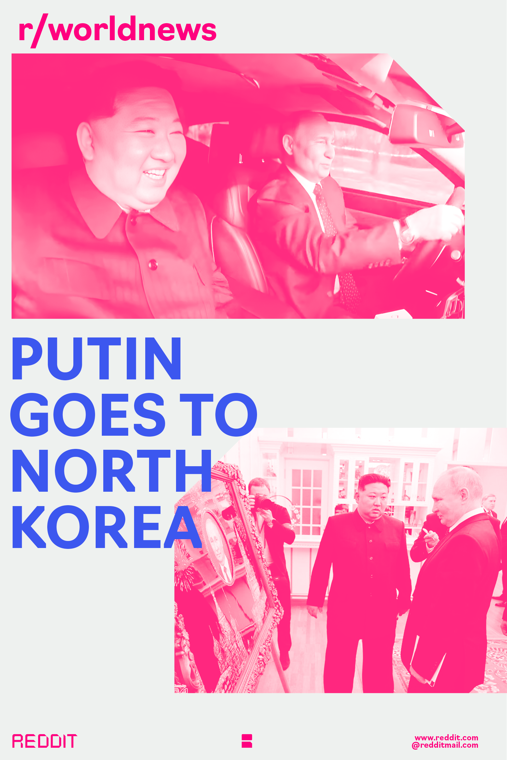
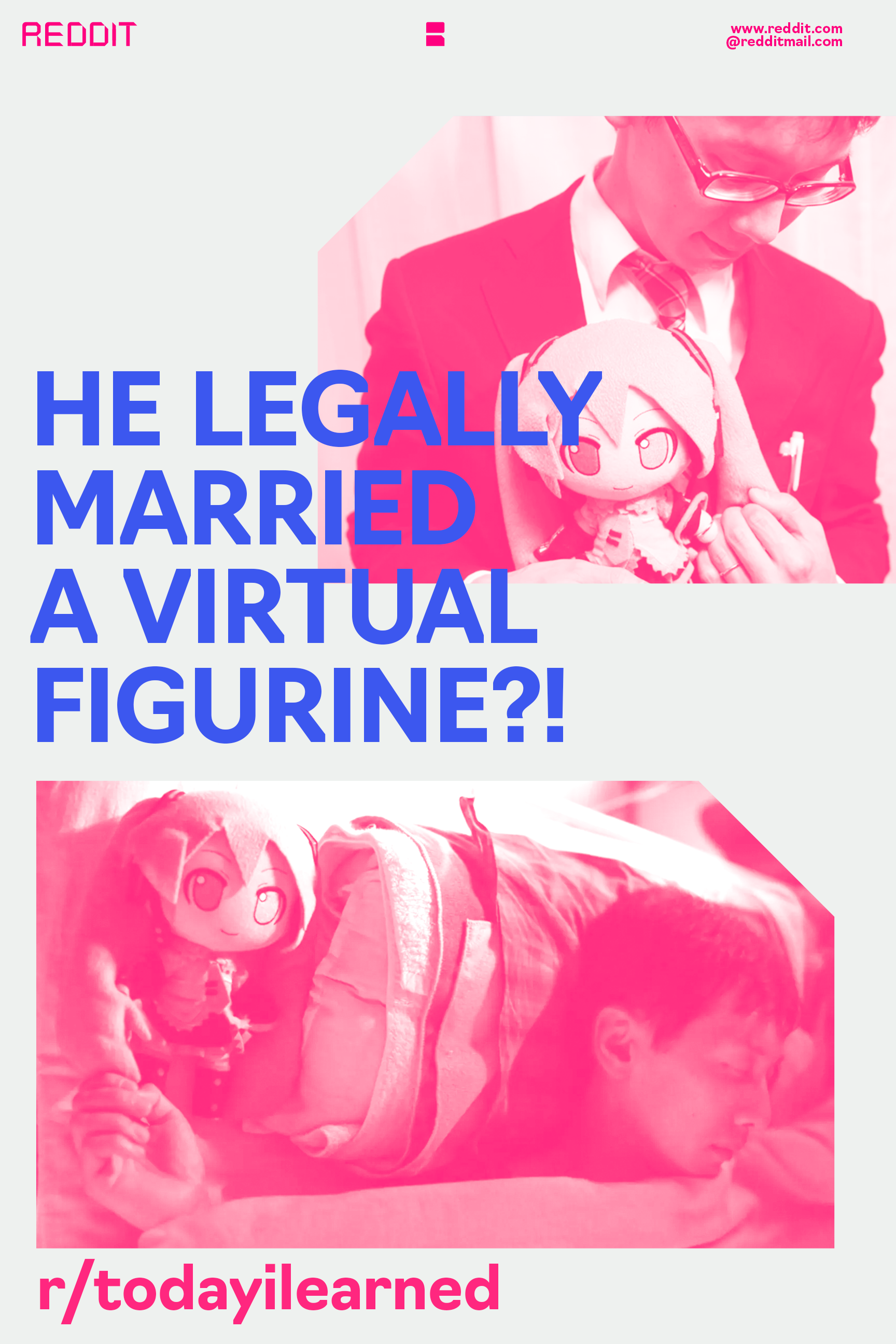
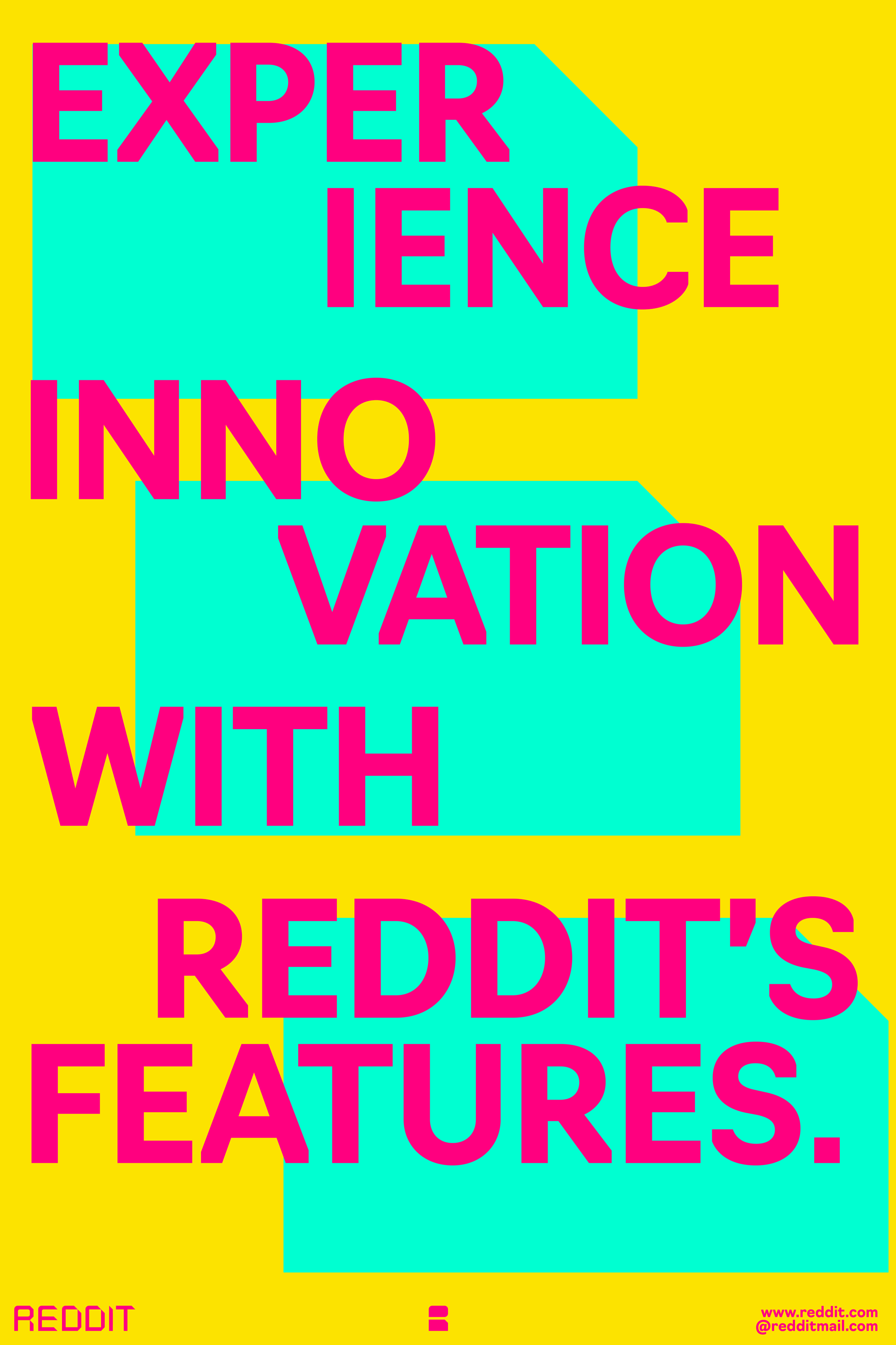
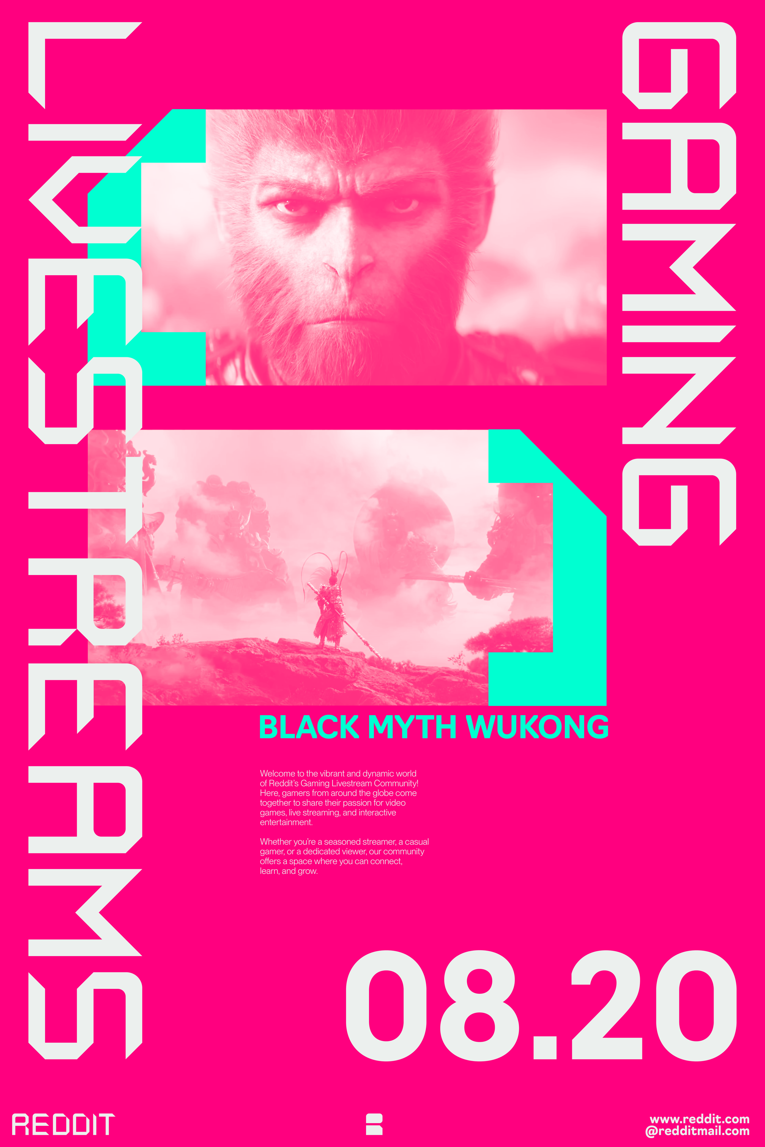
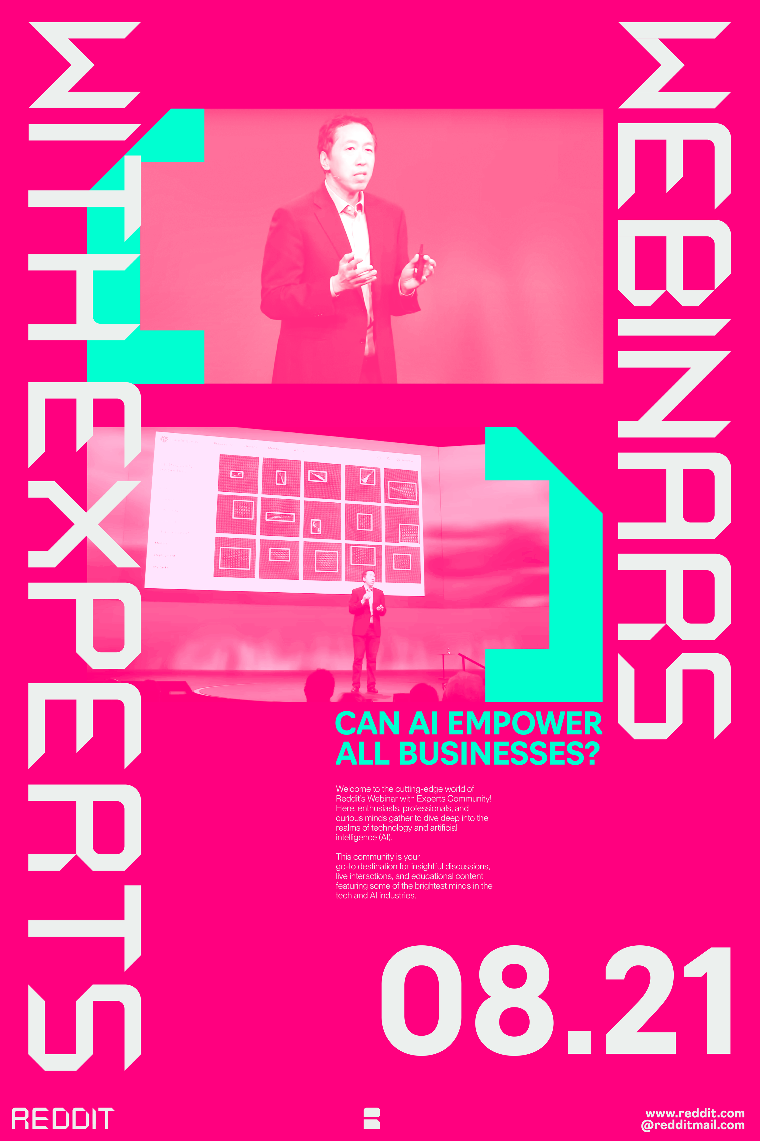
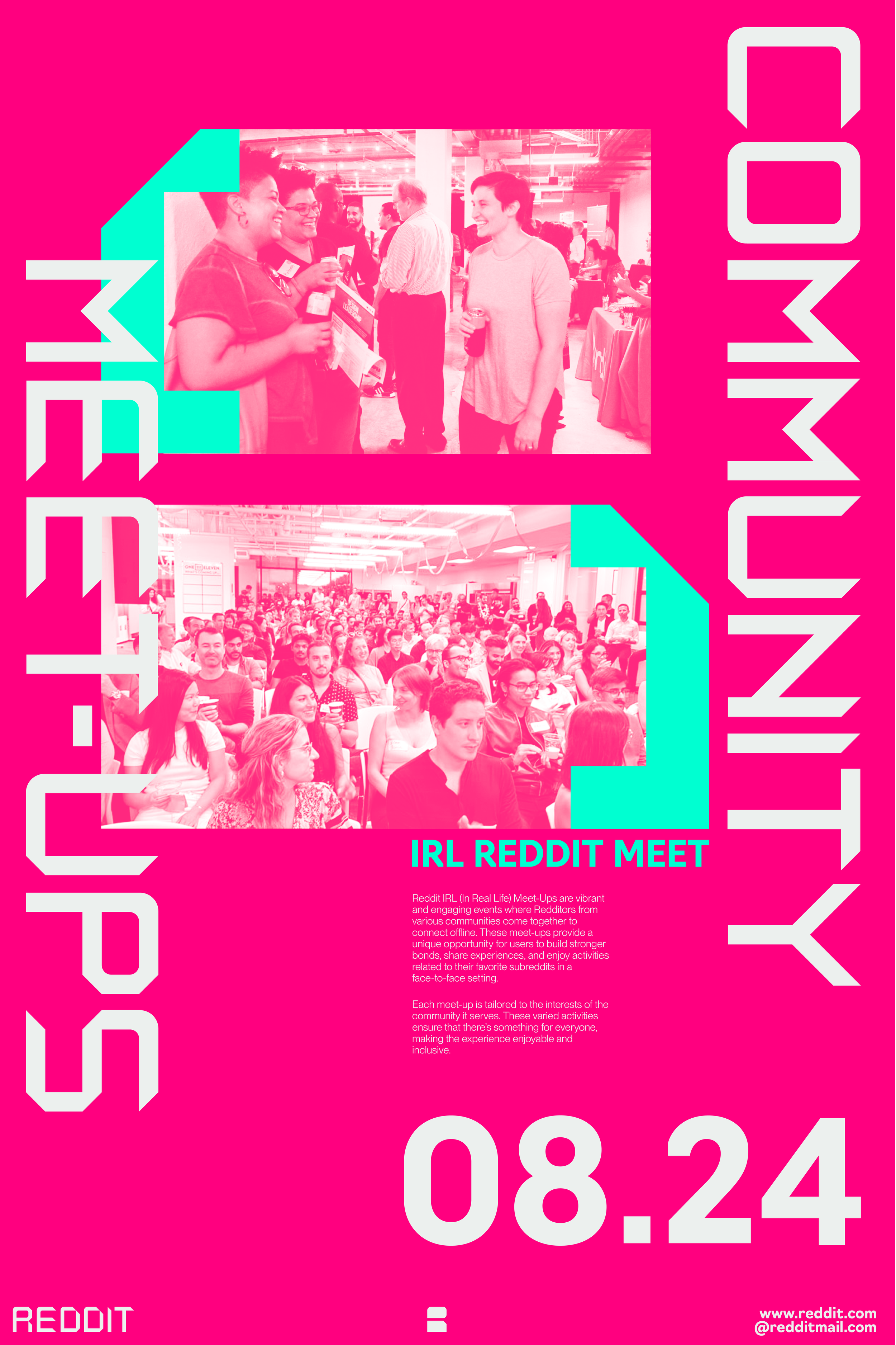
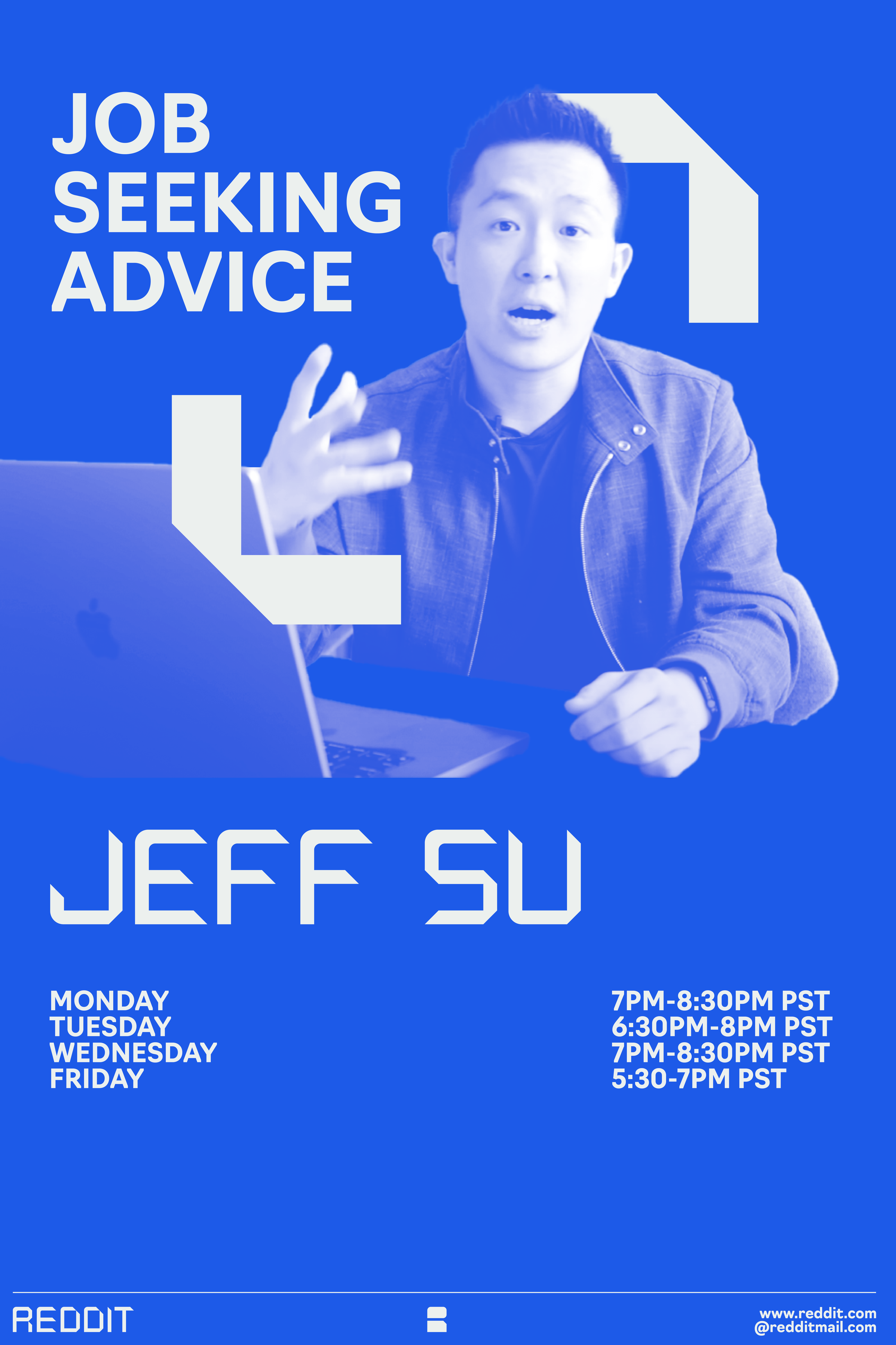
Brand elements and textures in the identity posters highlight the boldness and uniqueness of the brand. I utilized my custom typeface throughout these posters to reinforce the brand's distinctive visual identity.

Content Poster Series:
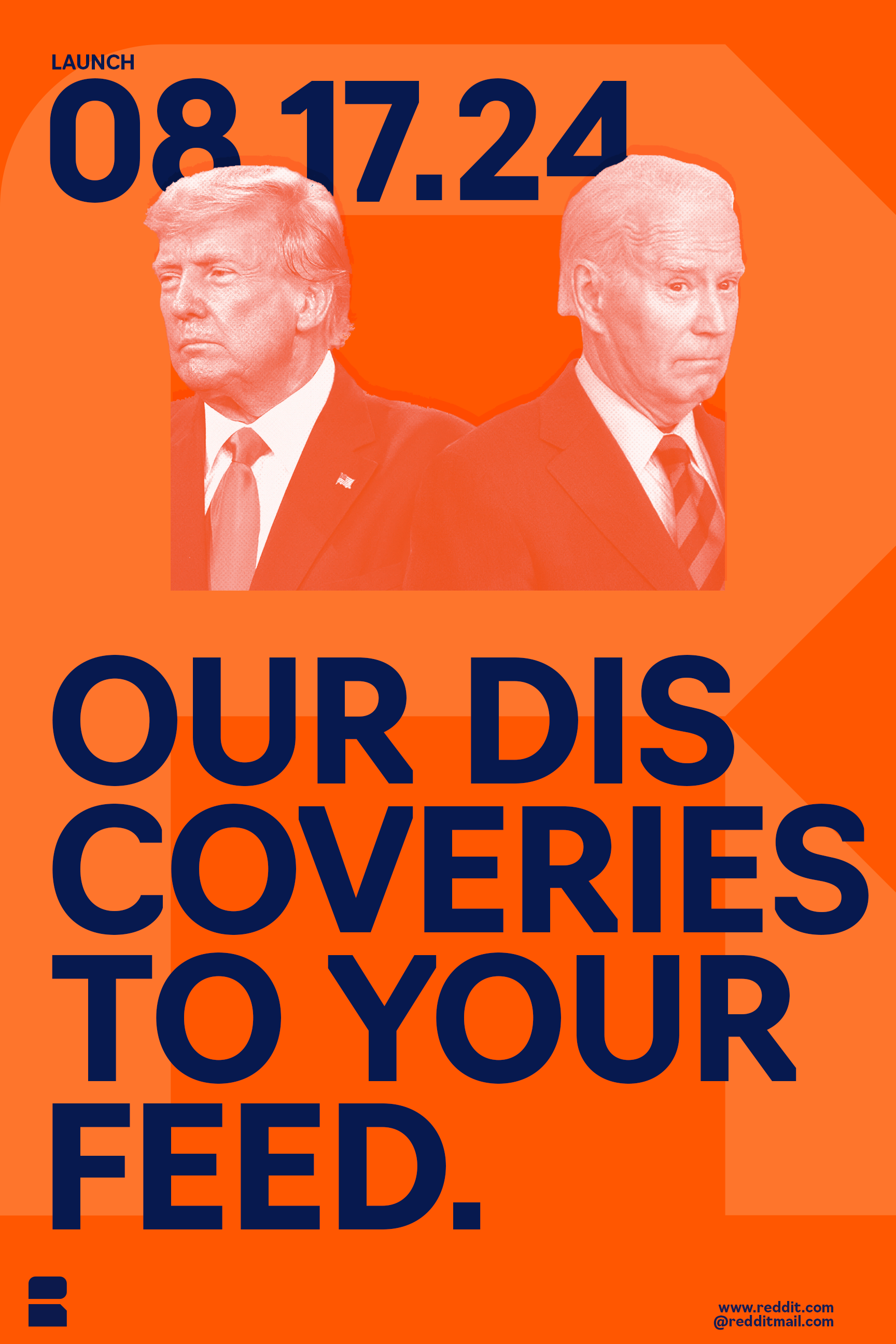
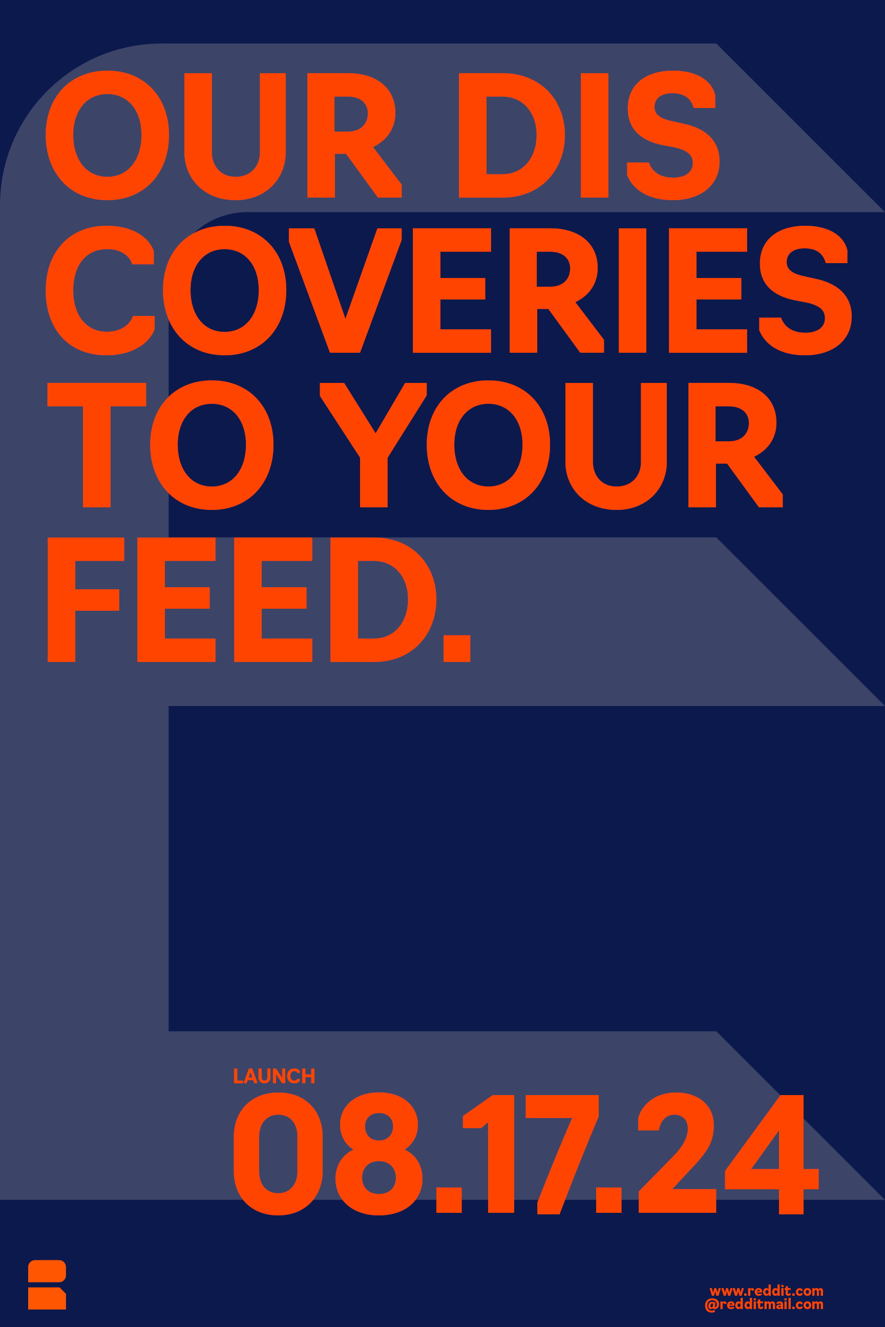
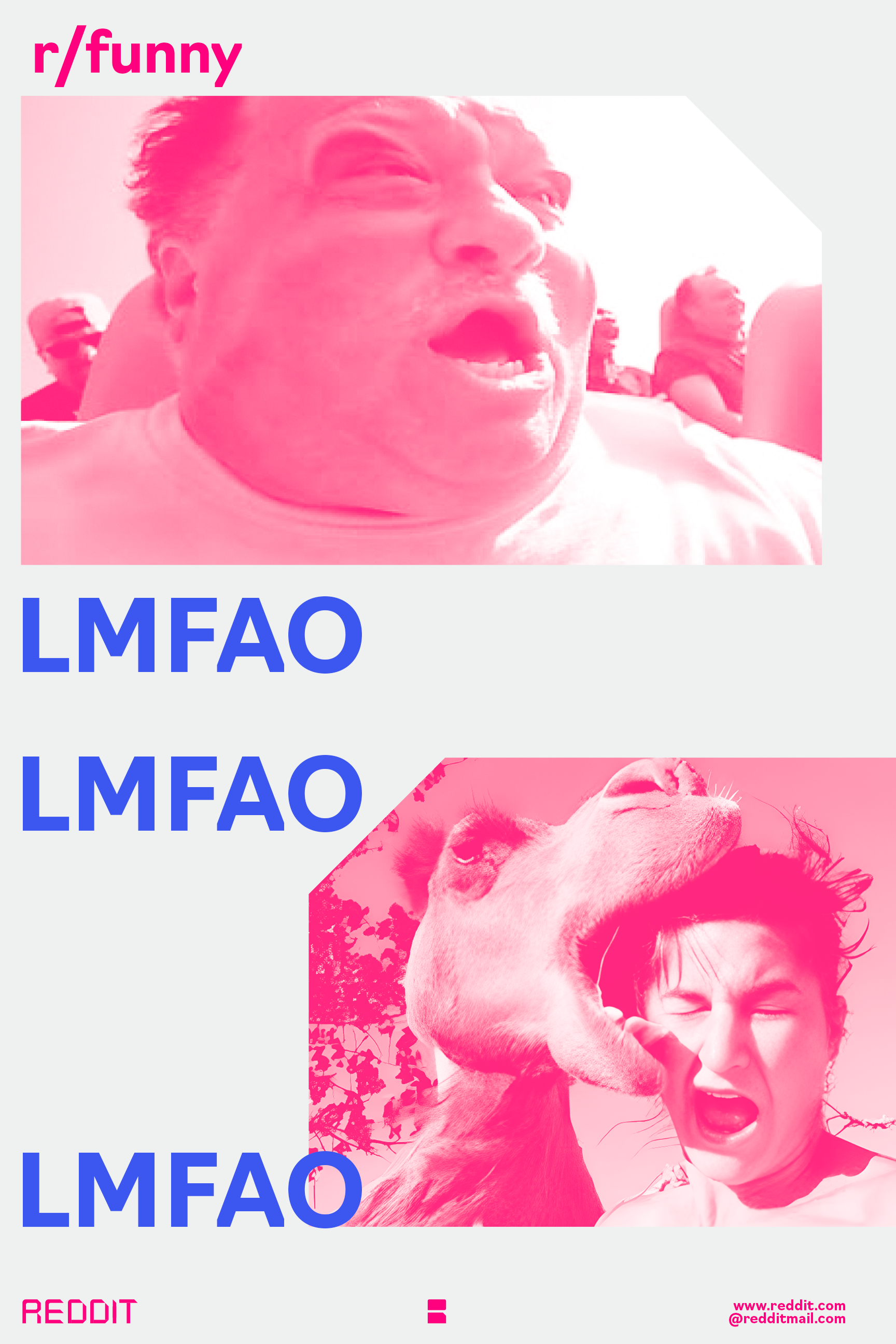
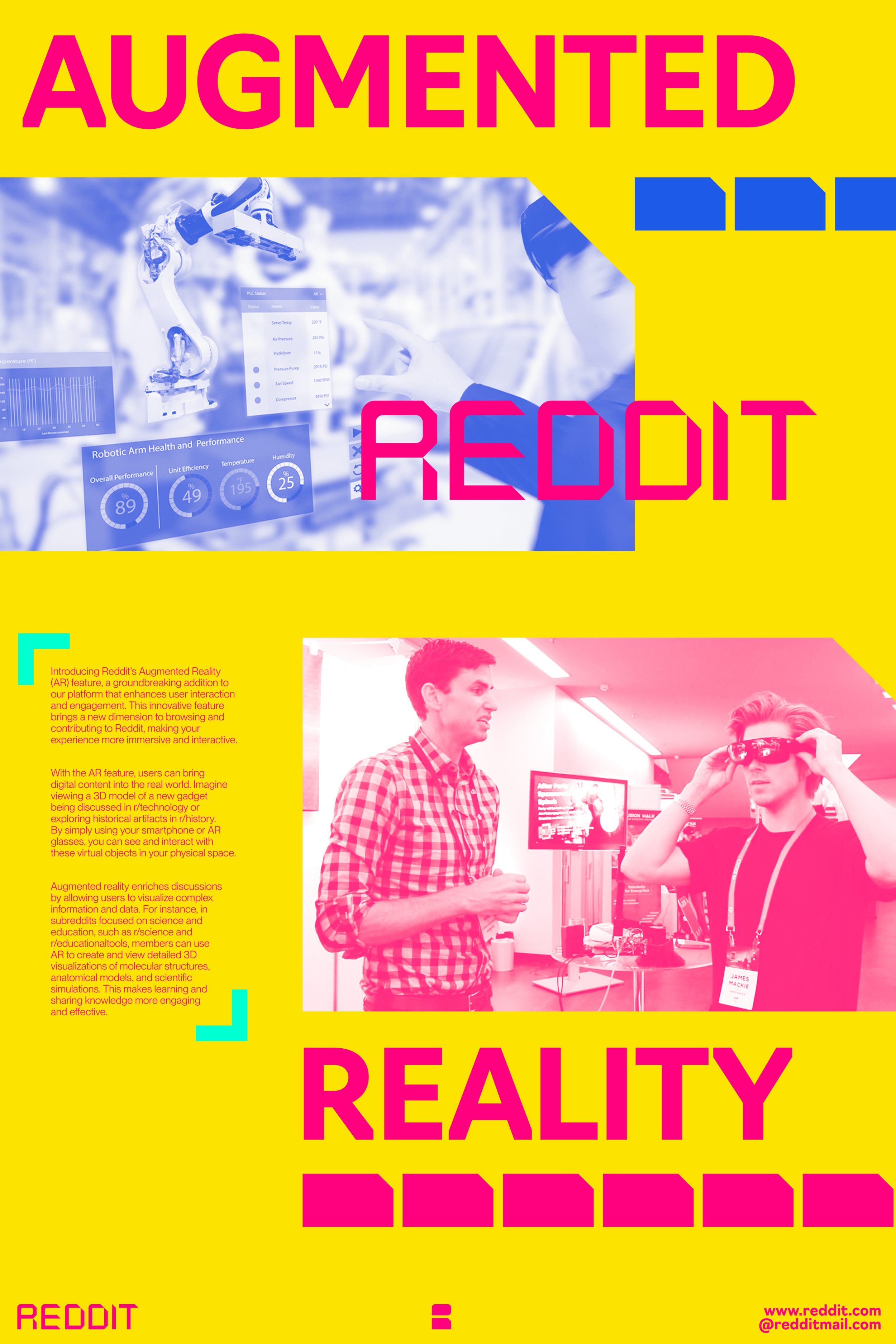
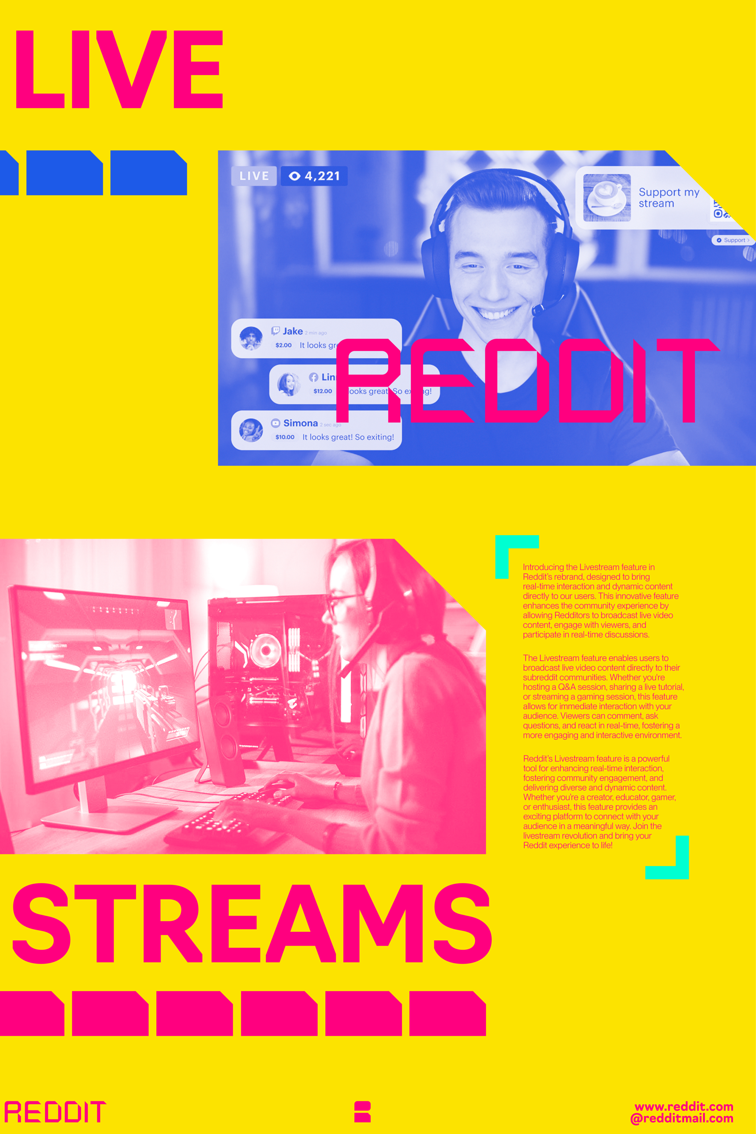
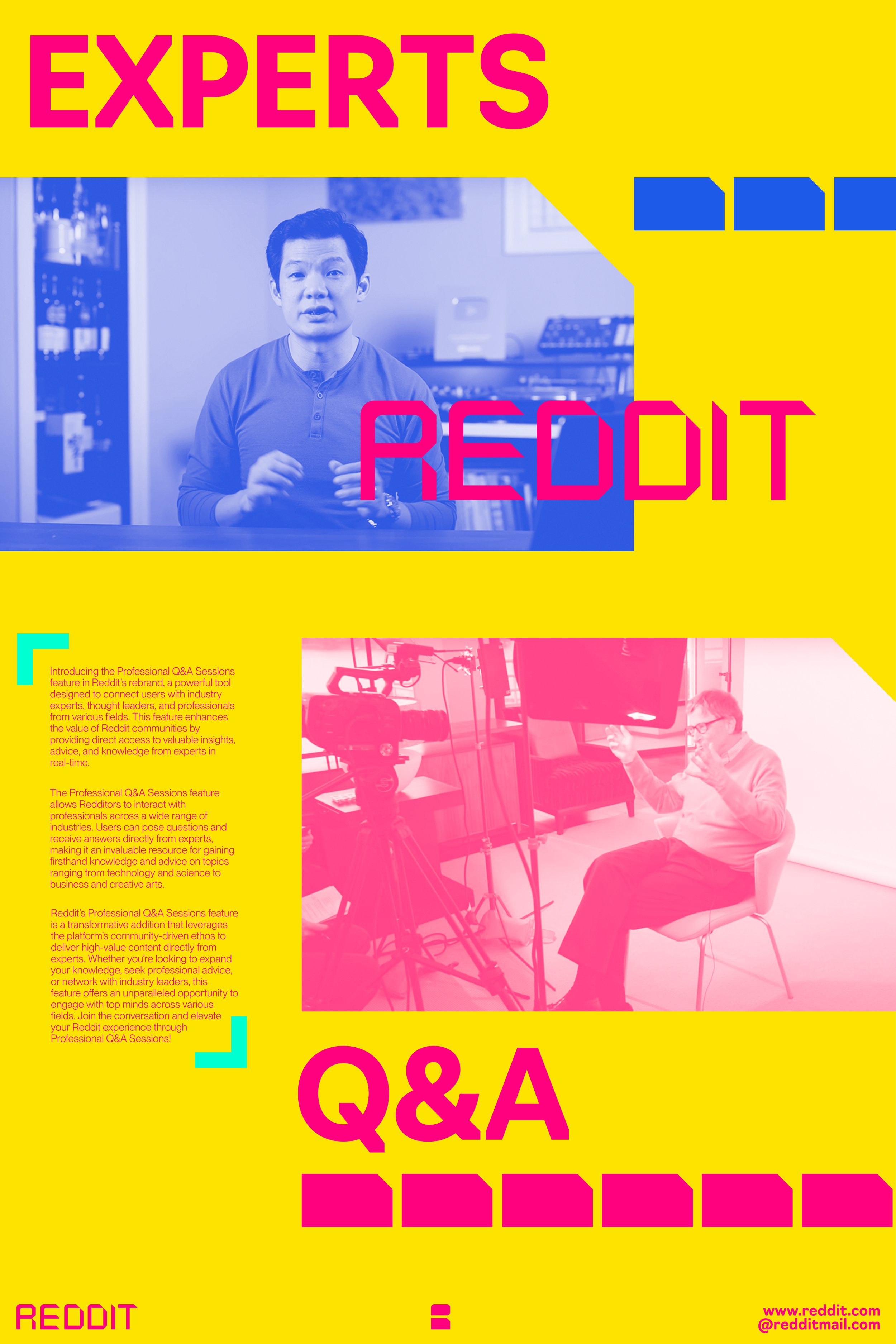
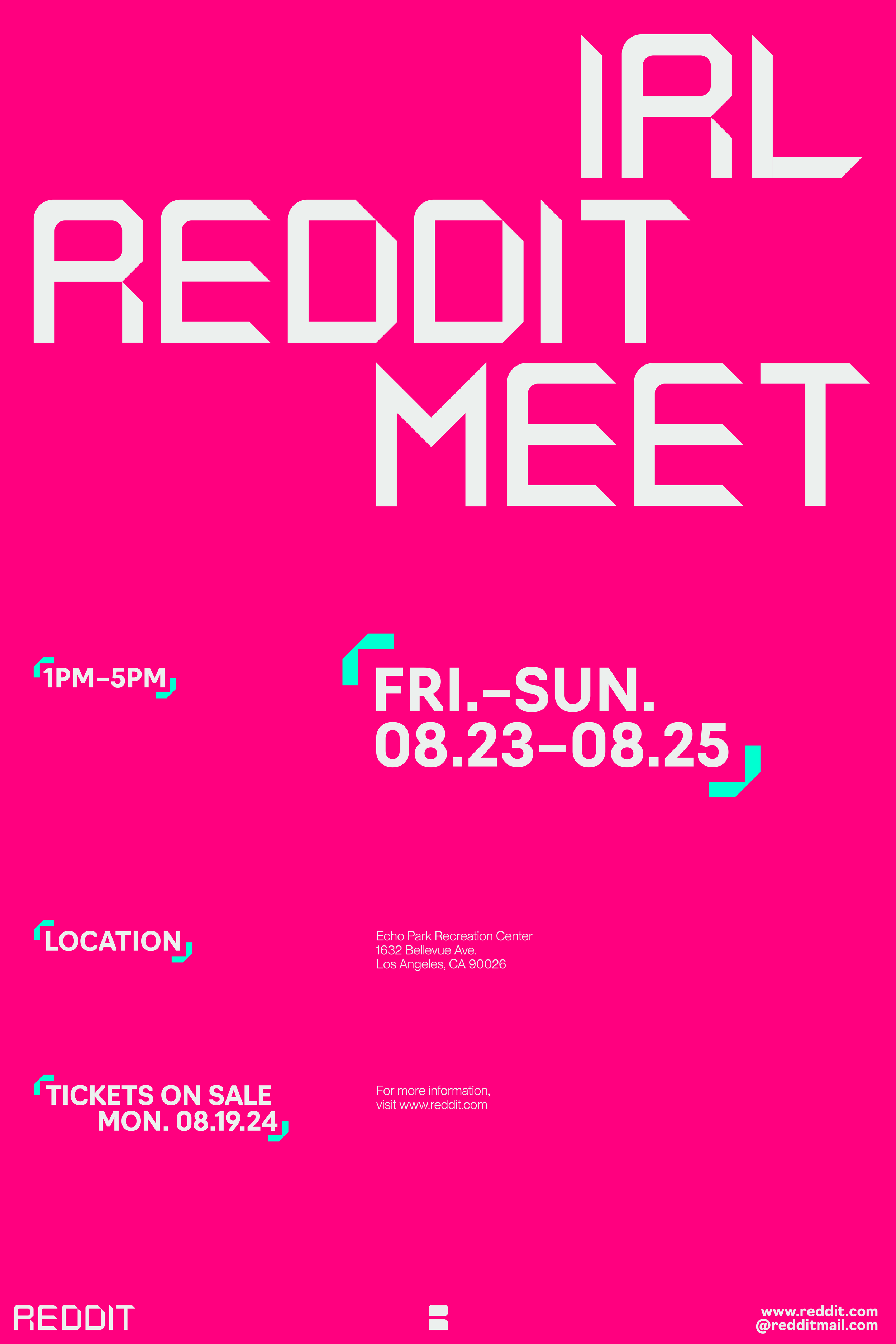
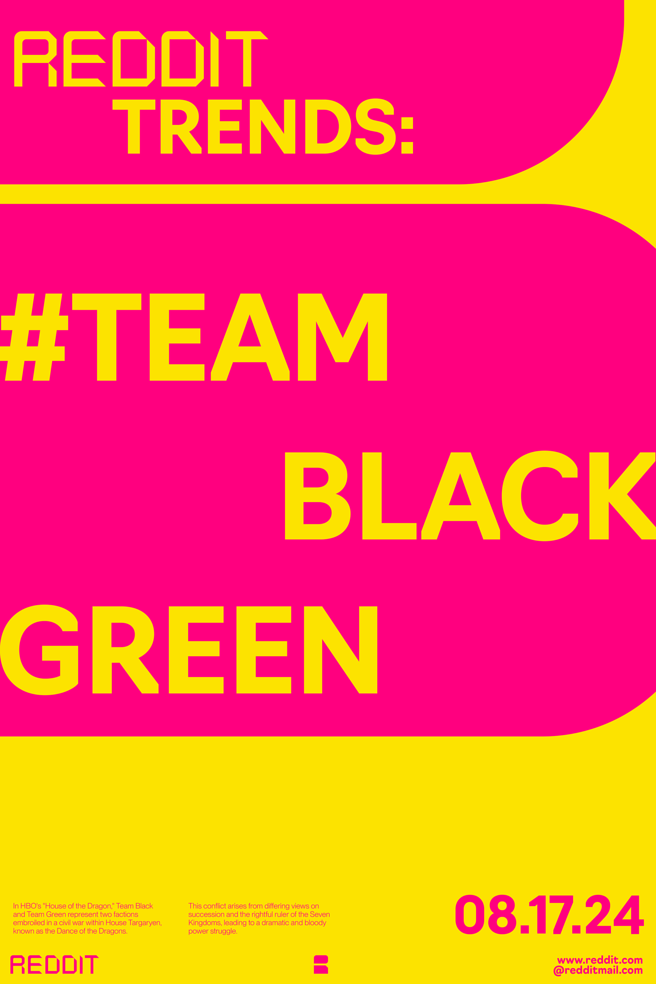
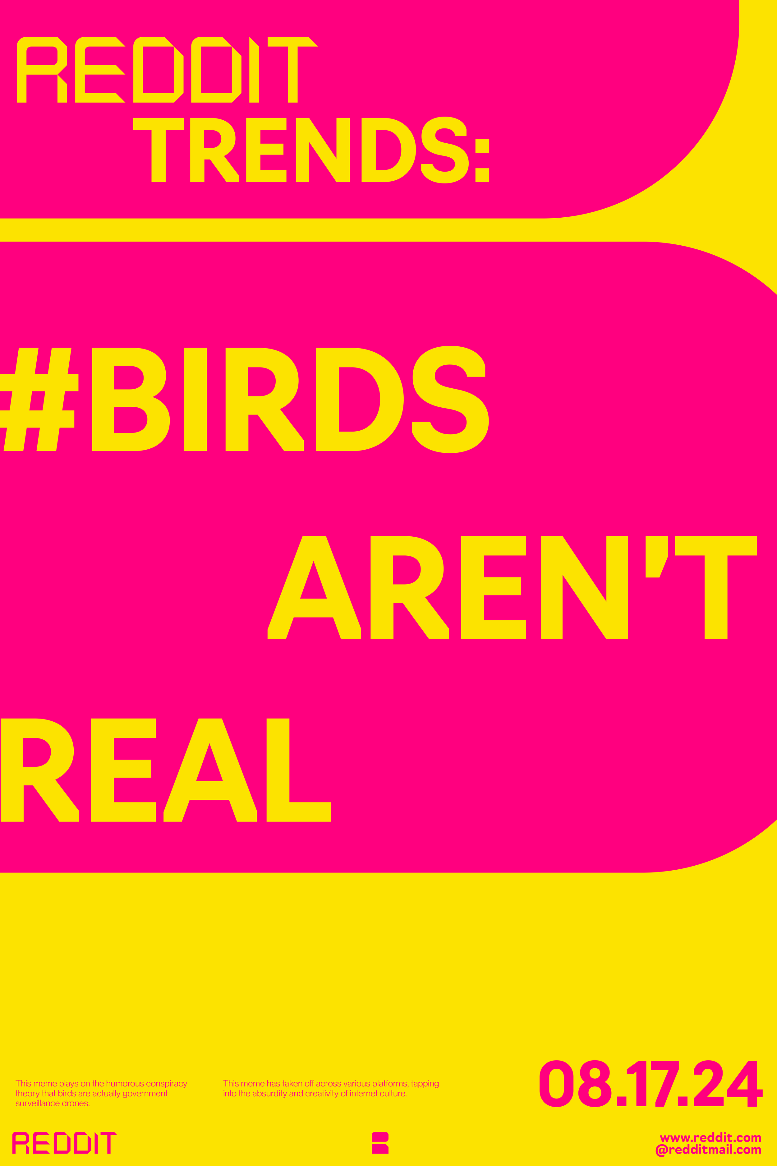
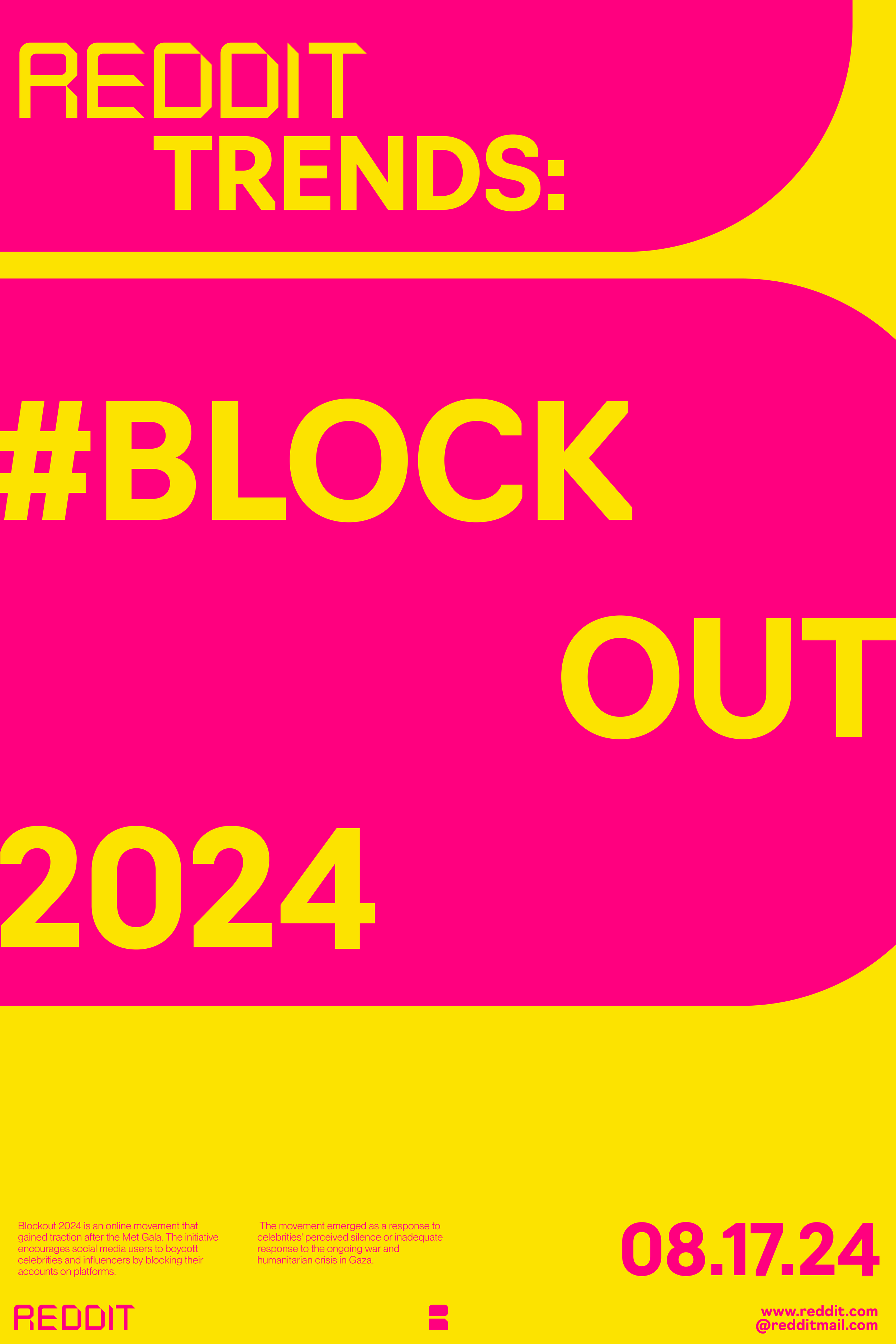
Content posters promote various aspects and features of the brand such as community, new features, live events, educational content, and hashtag trends.
Environmental/Outdoor Mockups:
The goal of outdoor mockups is to spread brand awareness on a larger physical scale in big cities and other appropriate environments that correspond with the core aspects of Reddit.
Website, Social Media, and App:
The website, social media, and app interface offer user interaction across various pages while featuring topics and subjects tailored to personal algorithms.


